Your Instagram isn’t the problem.
The strategy is.
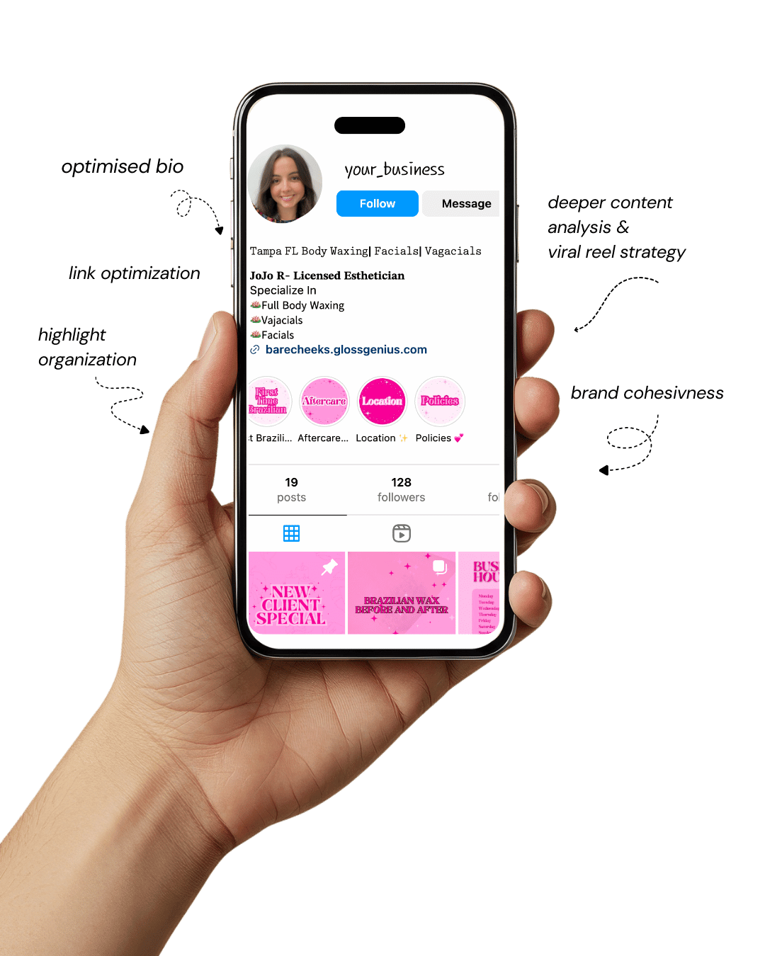
Get a free, honest audit of your Instagram profile — tailored for beauty, wellness & creative brands.
You’ll receive: profile fixes · content gaps · bio upgrades · content ideas.
I personally review your profile and send a clear, actionable breakdown — no AI, no templates.

If you’ve ever wondered why some Instagram Stories instantly grab attention while others get skipped, it all comes down to one thing — Insta story layout ideas.
Whether you’re a creative professional, foodie, or fashionista, the right layout can completely transform how your audience interacts with your content.
Instagram Stories are no longer just for sharing quick snaps; they’ve evolved into a dynamic tool for storytelling and branding.
With over 500 million daily users, Stories offer an incredible opportunity to boost engagement, showcase your aesthetic, and build genuine connections.
But here’s the reality — people swipe fast, and you have just a few seconds to impress. That’s where thoughtful layout design comes into play.
By using smart composition, engaging visuals, and interactive features, your Stories can stop the scroll, spark curiosity, and encourage followers to take action.
Each element — from color choices to text placement — works together to create a seamless, professional flow that holds attention and leaves a lasting impression.
It’s about turning everyday posts into visually magnetic moments that connect, inspire, and drive engagement.
How Smart Layouts Turn Viewers Into Engaged Followers
Before jumping into creative Insta story layout ideas, it’s essential to understand why layout design has become so influential.
Think of your Instagram Stories as mini billboards in your audience’s hands — compact, fast-moving, and full of potential.
A strong layout isn’t just about looks; it’s about clarity, rhythm, and guiding the viewer’s focus toward your message or call to action.
Consistent design builds visual identity and trust. When followers recognize your signature style — the color palette, typography, or framing — they instantly connect that aesthetic with your brand.
Layouts that are clean and balanced naturally hold attention longer, and that extra second of engagement can make a real difference in visibility.
There’s also a technical side: Instagram’s algorithm favors content that keeps users watching. A well-structured layout can increase retention time and, in turn, boost reach.
That’s why understanding layout principles isn’t just an artistic choice — it’s a growth strategy.
Every slide you design becomes an opportunity to strengthen connection and elevate engagement through visual storytelling.
Insta Story Layout Ideas for Maximum Engagement
Designing Instagram Stories that hold attention and drive engagement is part art, part psychology.
Every color choice, font, and element placement affects how long people watch and how likely they are to act.
These are some practical Insta story layout ideas that blend creativity, brand consistency, and technical know-how — the kind of layouts that help you turn casual scrollers into engaged followers.
1. The Minimalist Grid Layout
Minimalism is one of the most powerful visual tools on Instagram. By using clean lines, symmetry, and generous white space, you create a professional and calming experience for your viewers.
A minimalist grid layout works beautifully when you want to highlight one core message, product, or moment without distractions.
Use tools like Canva, Unfold, or Mojo to create balanced grids that maintain alignment and uniform spacing.
Stick to a limited color palette and one or two fonts to ensure clarity. This design principle is not just about style — it improves information retention by letting your content breathe.
A quiet, elegant composition naturally holds the viewer’s focus longer.
2. The Layered Collage
Collage layouts add personality and texture, making them ideal for foodies and fashionistas who want to showcase multiple looks, angles, or dishes in one frame.
The trick is layering intentionally. Mix transparent textures, subtle shadows, and overlapping visuals to mimic a magazine-style spread without chaos.
A consistent color tone ties the layout together, while strategic layering of text and stickers keeps energy high.
This kind of creative messiness looks organic but takes thoughtful planning — always make sure your focal point remains clear.
When done right, layered collages convey movement, creativity, and storytelling depth.
3. The Color Story
Colors tell stories before words do. Using color intentionally across a sequence of Stories creates flow, emotion, and brand recall.
Build a gradient through your slides — from light to dark tones or across your brand colors — so that each Story transitions smoothly into the next.
If you’re a food blogger, try moving from warm, cozy tones to fresh greens to match meal transitions.
For fashion, shift shades to mirror moods — from calm neutrals to bold statement hues.
Matching tones across slides gives your audience a visually satisfying experience that subtly reinforces your brand identity every time they tap forward.
4. The Q&A Carousel
Turning your Stories into conversations drives deep engagement. A Q&A carousel layout encourages followers to pause, read, and respond.
Begin with an inviting slide like “You asked, I answered,” followed by a sequence of answers presented with clean typography and soft, readable backgrounds.
Spacing matters here — avoid heavy text blocks. Use contrast between question and answer colors so that each pops distinctly.
This type of Story layout builds authenticity by showing transparency and interaction, two key elements of brand trust.
5. The Poll and Quiz Frame
Interactive Insta story layout ideas like polls and quizzes aren’t just fun — they trigger micro-engagements that tell Instagram’s algorithm your content deserves to be seen more.
Create a cohesive frame design for your polls: a uniform header space, central question area, and equal spacing for poll options.
Keep visual balance consistent across each Story so that users recognize your interactive slides instantly.
Changing color tones slightly between polls keeps the design fresh without losing cohesion.
This layout transforms passive viewers into active participants, increasing retention and recall with every vote or answer.
6. The Product Feature Strip
When promoting products or menu items, your goal is clarity. A strip layout — either horizontal or vertical — allows you to dedicate one slide to each item while maintaining narrative flow.
Each frame can showcase a zoomed-in texture, a wide product view, and one key benefit in concise text.
Consistency in font size, alignment, and spacing helps establish professionalism. Include small interactive elements like tap-forward prompts or product tags to guide viewers naturally through your lineup.
With well-structured product features, your Stories feel more like curated showcases than random uploads.
7. The Before-and-After Split
Transformation content consistently outperforms most visuals on Instagram. The before-and-after split layout works perfectly for creative professionals, stylists, or food creators showing progress or results.
Use a vertical split where both halves are equal in size and balance. Keep color grading similar across both sides so the transformation itself becomes the focal point.
Labeling “Before” and “After” using minimalist text helps the viewer instantly understand the comparison. This layout tells a story in one glance — visual proof of improvement, creativity, or craftsmanship.
8. The Moodboard
Moodboards bring together emotion, color, and texture in a way that speaks directly to your audience’s senses.
They are ideal when you want to communicate brand vibe or seasonal inspiration rather than a direct promotion.
Mix lifestyle images, aesthetic quotes, and complementary textures. Arrange them with intention — darker tones on the edges, lighter elements in the center — to naturally guide the eye.
This layout is especially powerful for brands looking to establish emotional resonance and identity consistency.
9. The Tutorial Flow
Educational content keeps audiences engaged longer than most other types. Breaking down a process into 3–5 visually cohesive slides creates a narrative that’s easy to follow.
Each slide should feature one clear instruction paired with visuals that demonstrate the step.
Numbering slides (“Step 1,” “Step 2,” etc.) adds clarity and helps users stay oriented. Avoid clutter by focusing only on the essential visuals per step.
Ending with a call-to-action — “Save this tutorial” or “Try this look today” — encourages interaction and saves, signaling value to the algorithm.
10. The Countdown Teaser
Few Insta story layout ideas build anticipation like a countdown teaser. Whether you’re launching a product, releasing a recipe, or teasing an event, design a layout that centers attention on the countdown sticker.
High contrast between text and background heightens visibility. A consistent visual rhythm — same placement for each slide but varying colors or shadows — creates a sense of momentum.
By leading viewers toward a specific date or moment, you turn curiosity into excitement and excitement into action.
11. The Text-Only Power Slide
Sometimes simplicity has the loudest voice. A text-only layout cuts through the noise, forcing focus on your message.
Use impactful typography with a strong visual hierarchy — a bold statement on top, smaller supporting text below.
The absence of imagery draws attention to the words themselves, making this layout ideal for quotes, updates, or opinions.
Maintain legibility with contrasting colors and ample line spacing. A single, well-composed text slide can convey authority, confidence, and clarity all at once.
12. The Quote Stack
Quote-based layouts perform exceptionally well because they’re relatable and shareable. Layer your quotes using contrasting font weights or color blocks to create rhythm and depth.
Instead of static text, combine light motion graphics or animated backgrounds to keep your slides visually alive.
Ensure that your quote tone matches your audience — motivational for creatives, witty for fashionistas, reflective for lifestyle brands.
When your quotes resonate, they get shared, and every share is organic brand exposure.
13. The Swipe-Up Flow
Even with Instagram’s link stickers replacing swipe-ups, the principle of guiding movement remains crucial.
Design your layout so that every visual element leads the eye downward to your link or CTA.
Vertical lines, gradient fades, or directional icons subtly encourage viewers to take action. The goal is to make your link feel like a natural next step rather than an abrupt command.
Smooth flow combined with enticing wording (“Discover More,” “Shop the Look”) increases click-through rates significantly.
14. The Review Highlight
Social proof builds instant credibility. Present customer testimonials or product reviews in clean, symmetrical layouts that prioritize readability.
A balanced split between visuals and text keeps the design modern while showcasing authenticity.
Highlight key phrases within each review using color contrast or subtle emphasis to draw attention to positive sentiment.
Adding the reviewer’s image or handle adds legitimacy and strengthens connection. This structure turns user feedback into a design element that reinforces trust.
15. The Highlight Cover Set
Highlight covers are the silent storytellers of your profile — the first thing new visitors notice when they explore your Story archive.
Each cover should mirror your brand tone: icons for minimalists, soft photography for lifestyle accounts, or gradients for modern aesthetics.
Maintain identical icon size, alignment, and background hue to ensure visual balance. Consistent design across all covers signals professionalism, and thoughtfully named highlights (“Shop,” “Events,” “Tips”) make navigation intuitive.
A cohesive highlight set instantly elevates your brand’s perceived quality.
How to Improve Results with Smart Layout Strategy
Having great Insta story layout ideas is just the start. To get the best results, combine design strategy with analytics and consistency.
Start by reviewing your Story insights — note which layouts retain viewers the longest or lead to the most interactions.
Use this data to shape future designs. Also, maintain consistency in color, typography, and pacing. Your audience should instantly recognize your brand, even before reading your name.
Leverage Instagram’s built-in tools like polls, quizzes, sliders, and question stickers strategically within your layouts.
Each interaction signals engagement to the algorithm, boosting reach.
When designing, stay mindful of margins — keep essential text and buttons within Instagram’s safe zones to prevent cropping on different screen sizes.
Finally, batch-create layouts using design tools like Canva, Figma, or Adobe Express. This ensures quality and uniformity across all Stories.
By combining analytics, creative design, and consistency, you’ll not only make your Stories visually appealing but also strategically powerful — helping you turn casual viewers into loyal followers.
Final Words
Creative, engaging Insta story layout ideas aren’t just about aesthetics — they’re about strategy, storytelling, and connection.
Every font choice, color transition, and animation contributes to how your audience perceives your brand.
Whether you’re a fashionista showcasing outfits, a foodie revealing recipes, or a creative sharing behind-the-scenes moments, your layout can make or break engagement.
The key is to experiment, analyze, and evolve. Use these 15 layout ideas as a foundation, but don’t be afraid to add your personal touch. Authenticity paired with smart design is what truly stands out.
Remember, your Stories are a living portfolio — a direct window into your creativity.
Treat each slide like a chapter of your brand story, and soon, your followers won’t just watch — they’ll interact, connect, and come back for more.