
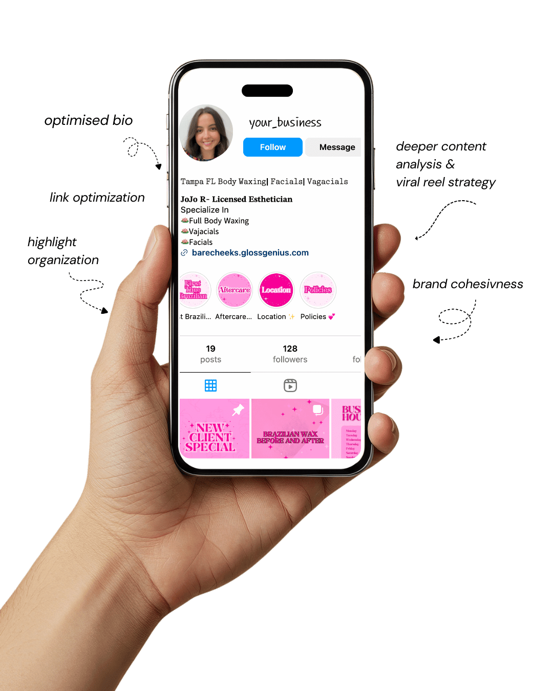
Your Instagram isn’t the problem.
The strategy is.
Get a free, honest audit of your Instagram profile — tailored for beauty, wellness & creative brands.
You’ll receive: profile fixes · content gaps · bio upgrades · content ideas.
I personally review your profile and send a clear, actionable breakdown — no AI, no templates.
Canva design ideas can completely transform how your brand feels — especially when you’re trying to create that “rich girl aesthetic” without spending a rich girl budget.
In the world of digital branding, visuals speak before your caption ever gets a chance.
If your designs look refined, clean, and expensive, people automatically assume the same about your business.
The right Canva design ideas help you create that premium impression.
Today, the online space is crowded with content, but most people end up recycling the same Pinterest templates.
The secret to standing out isn’t about adding more — it’s about subtracting. Minimalism, luxury spacing, typography hierarchy, and smart color usage instantly elevate brand perception.
When you understand how Canva tools like grids, brand kits, spacing, and transparency work together, your designs stop looking DIY and start looking designer level.
The “rich girl” look is all about soft neutrals, elegant fonts, metallic accents, and intentional visual breathing room.
These techniques make your graphics look like they came straight from a high-end creative studio.
Whether you’re a creator, business owner, or someone building a Pinterest or Instagram strategy, mastering premium Canva design ideas will give your brand presence — without paying a designer or hours of frustration.
Why Expensive-Looking Design Matters
Visual branding is your first handshake. Every time someone sees your content, they form an opinion within 0.13 seconds.
Clean and premium Canva design ideas help ensure that the opinion they form is: professional, trustworthy, and high value.
Expensive-looking branding increases perceived value. People are willing to pay more when something looks exclusive.
For digital entrepreneurs, that means higher-priced offers, fewer price objections, and better engagement.
Premium aesthetics also build consistency. Using the same tones, typography, spacing, and layout helps your audience instantly recognize your brand — even without a logo.
Canva has tools many people overlook — like Global Styles, Brand Controls, and Style Matching — that let you lock your aesthetics across platforms.
High-end brands know that space is a design element. Instead of filling every inch, they use margins, negative space, and alignment to create balance.
This is an advanced design principle that separates amateur from luxury.
When you apply intentional Canva design ideas to your posts, people subconsciously associate “elegance” and “quality” with your business.
The result? Better conversion, more followers, and a more influential digital presence — all from thoughtful design choices.
1. Minimalist Luxury Layouts
Minimalism is the foundation of luxury design. When using Canva design ideas, start by removing anything unnecessary — less is always more.
Luxury brands don’t fight for attention with clutter; they create calm, open spaces that allow the viewer to breathe. The goal is to design with intention.
Instead of filling every inch with shapes, text, and graphics, choose one powerful image and support it with a clean headline.
Inside Canva, turn on File → View Settings → Show Rulers & Guides and start placing your elements using clear alignment points.
This gives structure and makes your layouts look like professionally designed magazine spreads.
Instead of trying multiple overlapping elements, keep everything grounded within an invisible grid. This structure instantly elevates the quality and perception of your work.
Typography also plays a vital role. Use one serif font for your title to add elegance and a simple sans-serif for readability.
Increase letter spacing and line spacing — these subtle spacing tricks make your design look intentional rather than accidental. Luxury isn’t loud. Luxury whispers.
When applying minimalistic Canva design ideas, think like a stylist, not a collector. You’re not decorating a scrapbook; you’re curating a brand. Every element must justify its presence.
2. Neutral Color Palettes
Color choice determines whether a design looks premium or playful. Luxury brands lean into neutrals because they visually communicate calm, order, and refinement.
When looking for Canva design ideas that make your brand feel expensive, neutrals are the quickest way to get there. Think champagne, sand beige, deep latte, ivory, and soft black.
These shades naturally harmonize because they’re derived from nature. Bright neons or oversaturated tones often cheapen the design, pulling the attention away from your message.
Inside Canva, set up a Brand Kit so your palette becomes effortless to apply across all content. This ensures that whether you’re designing pins, carousels, or covers, the colors always match.
A professional technique is to build your palette with three main neutrals and one metallic accent.
The metallic accent should be used sparingly — just enough to suggest richness without overpowering the design.
The color picker tool is also a game changer. Use it to pull colors directly from your product photos or images — this prevents the common problem where text and objects appear disconnected from the main visual.
Neutrals don’t bore people — they calm them. They allow the design to feel cohesive, premium, and visually intentional, which is what makes these Canva design ideas so effective.
3. Elegant Serif Typography
Typography is what separates amateur-looking content from editorial-level design. High-end brands never use overly decorative fonts. Instead, they rely on refined serif fonts that hold elegance in every curve.
Think about iconic fashion brands — when you see their type, you immediately feel that elevated presence.
Well-chosen typography is one of the most powerful Canva design ideas for making a brand look expensive without changing anything else.
When designing, limit yourself to two fonts: a strong serif for your headline and a clean sans serif for supporting text.
This contrast creates visual hierarchy and signals confidence. Take advantage of Canva’s letter spacing tool to create that airy, editorial feel, especially when using all caps on headings.
Increasing spacing gives designs a “finished” quality and prevents text from looking cramped.
Another advanced tip is to adjust line height. Tighten the space between lines for subheaders and expand space on main headers.
These micro adjustments mimic the layouts you see in luxury magazines.
Typography is silent persuasion. Even if the viewer doesn’t consciously notice the style, they will feel the impact.
When refined typography meets intentional spacing, even a simple quote turns into an aesthetic masterpiece. That’s the power of using thoughtful Canva design ideas.
4. Gold Foil Accents
Gold accents are the visual equivalent of jewelry for your design — subtle, polished, and intentional. They add elegance without overwhelming the viewer.
Instead of filling text with a flat yellow, search for gold foil textures inside Canva under the Elements tab. These textures add depth and realism, which creates dimension and sophistication.
The key with gold accents is restraint. Gold should complement the design, not become the focal point.
When used within Canva design ideas, apply it as a thin line, an outline, a corner accent, or a subtle detail around product highlights.
Transparency is your friend here. Reducing opacity makes gold appear softer and more premium.
Another professional detail is layering. Place gold textures behind text or images and adjust them using Canva’s layer control. When layered correctly, gold doesn’t scream — it whispers class.
Luxury design isn’t about adding more sparkles; it’s about knowing where not to add them. A delicate touch is what creates that expensive feeling.
5. Collage-Style Pinterest Graphics
Collage graphics are exploding on Pinterest because they feel curated, personal, and premium. They look effortless yet editorial, which is exactly why they work.
This is one of the trendiest Canva design ideas for creators who want to look like influencers or luxury brands.
The best collage graphics mix aesthetic imagery with modern shapes and textures. Think torn paper edges, film frames, and overlapping polaroid-style images.
Instead of filling the collage with random pictures, decide on a theme — soft neutrals, travel inspo, lifestyle shots—and stick with it. Consistency gives the design a story.
When working with a collage style, symmetry is your invisible anchor. Group your elements strategically and adjust their layer order to establish depth.
One common mistake new designers make is not locking layers, causing elements to shift accidentally. Locking elements shows control — and control is luxury.
Collages make your audience feel like they’re peeking into someone’s curated lifestyle board. And in digital aesthetics, desirability is everything.
6. Elevated Product Mockups
Mockups are one of the most valuable Canva design ideas for making your brand look established. A mockup turns something digital into something tangible.
When someone sees your digital product on a book cover, screen, or packaging, it becomes more believable — and more buyable.
In Canva, upload your design, apply it to a mockup, and adjust its size so the dimensions look natural. You can even tweak shadows, lighting, or surface reflection to match the tone of your brand.
The difference between an okay mockup and a luxury mockup is attention to detail. Avoid stretching your image to fit a mockup. Instead, manually position it and adjust perspective.
People trust what they can visualize. When they see your course, e-book, service package, or digital product mocked up beautifully, it shifts their mind from curiosity to desire.
Premium visuals create premium perception. That is the magic of these Canva design ideas.
7. High-End Photo Filters
Photos are emotional triggers. High-end brands use muted, low-saturation images with soft contrast because they convey peace and confidence.
This is why filters are one of the most powerful Canva design ideas to transform an average design into an editorial one.
Start with a filter that fits your brand tone, then fine-tune it manually. Reducing saturation gives images a creamy feel, while increasing clarity creates crispness.
By lowering highlights, you avoid harsh lighting and create that soft-camera look used in luxury campaigns.
The trick is consistency. Choose one filter style and apply it across your entire brand. This builds a strong, recognizable aesthetic.
When all your visuals feel like they came from the same world, your brand becomes unforgettable.
8. Vogue-Inspired Quote Graphics
Quotes are the most shared type of content, and when styled right, they elevate your brand into the editorial realm.
Vogue-inspired design focuses on powerful typography, open space, and emotional punch. These Canva design ideas work beautifully when you want your audience to feel your brand rather than just see it.
Use a refined serif font, center the text, and keep everything clean. Give your quote room — luxury designs don’t overcrowd.
The magic lies in spacing and placement. Position text vertically centered and use a lot of negative space around it. That space signals exclusivity.
Add a small name or brand attribution at the bottom using a minimalist sans-serif font. The contrast adds quiet sophistication.
The result is a design people want to save, share, and repost — which increases your visibility and authority.
9. Balanced Grid Layouts
Grids create structure and order, making visuals look instantly organized and aesthetically pleasing.
Magazine layouts rely heavily on grids, and these same principles apply to Canva design ideas. Grids help maintain spacing, proportions, and alignment.
Instead of random placement, grids create visual harmony. You can insert multiple images, text, and design elements without overwhelming the viewer.
The key is to balance large and small areas so the eye naturally travels across the layout. When using grids for mood boards, choose images that match your color palette. Tone consistency creates luxury.
Once you place elements, lock them. This ensures nothing shifts while editing. Designers don’t rely on “eyeballing.” They use structure, and structure equals elegance.
10. Luxury Branding Kits
A brand becomes luxury through consistency. Canva’s Brand Kit feature lets you store your exact fonts, brand colors, and logo so that every design aligns with your visual identity.
These Canva design ideas streamline your workflow and eliminate guesswork.
When designing, you no longer spend time trying new fonts or colors — you’re simply applying what’s already defined. Consistency builds recognition. Recognition builds authority.
Luxury branding isn’t about trends — it’s about intention and refinement.
Some Extra Steps to Elevate Your Results
Heading: Level Up Your Premium Aesthetic
1. Use Visual Breathing Room
Expensive design requires intentional spacing. Add 40–80px margins around text boxes for an editorial look.
2. Use Style Match
Canva recently released a tool that lets you extract colors and fonts from any image. This keeps your Canva design ideas consistent across posts.
3. Limit Your Design Assets
Choose 3 main elements: shapes, fonts, textures. Repetition = luxury.
4. Export High Quality
Download as PNG, set resolution to 300 DPI for crisp images. This technical detail separates polished from pixelated.
The secret to looking expensive isn’t adding more — it’s knowing where to stop.
Final Words
Expensive branding is a strategy, not a price tag. With the right Canva design ideas, anyone can create visuals that feel refined, intentional, and premium — even on a budget.
The more consistency you build into your brand — fonts, colors, layout rules — the more recognizable and memorable your content becomes.
Luxury design is not about complexity; it’s about balance, restraint, and professional execution.
Start simple, follow spacing rules, and let your brand breathe. In a world full of noisy content, elegance always stands out.