
Your Instagram isn’t the problem.
The strategy is.
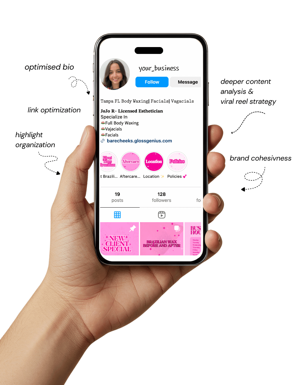
Get a free, honest audit of your Instagram profile — tailored for beauty, wellness & creative brands.
You’ll receive: profile fixes · content gaps · bio upgrades · content ideas.
I personally review your profile and send a clear, actionable breakdown — no AI, no templates.
A life coach brand thrives on clarity, trust, and visual consistency, and Instagram is one of the easiest places to express that identity with intention.
A feminine aesthetic—soft tones, clean graphics, confident typography, and subtle textures — helps your audience feel supported, calm, and open to transformation.
When these visuals are aligned with the message you want clients to associate with you, they not only look beautiful but also increase engagement, brand recall, and overall credibility.
Many coaches overlook how powerful a cohesive aesthetic can be for attracting aligned clients; the brain processes visuals far faster than text, which means your Instagram feed often becomes the first impression of your expertise as a life coach.
Beyond aesthetics, these designs influence how potential clients perceive your emotional presence.
When your templates feel organized, spacious, and thoughtfully constructed, they resonate with people who value personal development and want guidance from someone who clearly invests in their own standards.
Color psychology, micro-spacing, and typography pairings all play a role in shaping how your content feels energetically.
A feminine aesthetic leverages softness without losing authority, allowing you to embody both warmth and leadership.
The right design choices bring more depth to your online presence while ensuring your brand feels instantly recognizable.
Why These Designs Matter for Your Growth
A life coach aiming to grow a magnetic Instagram presence needs more than random quotes and sporadic branding.
The following feminine aesthetic designs help you establish consistency, communicate your values visually, and support the emotional tone behind your coaching style.
When people feel aligned with your energy from the moment they land on your page, they’re far more likely to follow, engage, and eventually convert into clients. In a saturated market, aesthetic cohesion becomes a quiet but effective differentiator.
Strong visuals also increase the perceived quality of your services, especially when your Instagram becomes a preview of the coaching experience.
Certain design styles subtly communicate structure, safety, and encouragement — qualities people look for in a life coach.
A polished feed signals that you respect your audience’s time and attention. It also influences the algorithm: visually appealing posts get saved and shared more often, which helps your content stay visible longer.
Many coaches don’t consider how small design elements — line weight, margin balance, or the emotional temperature of a color palette — impact how trustworthy and grounded the overall page feels.
When these components work together, your feed supports your brand voice, amplifies your messaging, and helps you stand out naturally without needing aggressive marketing tactics.
1. Nude & Blush Minimalist Quote Cards
This design style is ideal for a life coach who prioritizes calm, clarity, and emotional safety.
Soft blush tones paired with nude backgrounds create a grounded atmosphere that attracts clients seeking gentle guidance rather than high-pressure motivation.
Thin serif fonts combined with wide spacing give each quote room to “breathe,” making the message feel more intentional.
This aesthetic tends to perform well for saved posts because the calm palette is easy on the eyes and blends seamlessly with many Instagram feeds.
A subtle highlight layer behind certain keywords can add emphasis without disrupting the minimal feel.
Many coaches underestimate how effective contrast hierarchy is for shaping the reader’s emotional response. When done right, it leads the eye naturally through the message.
These designs also translate perfectly into Reels covers, helping your grid stay cohesive no matter how much video content you create.
2. Soft Watercolor Background Templates
For a life coach who leans into intuition, creativity, or emotional healing, watercolor backgrounds introduce softness and movement that appeal to clients who value fluidity. Gentle brush textures add depth while keeping the design approachable.
These templates work beautifully for carousel posts, where each slide flows like pages of a calming journal.
Color blending also allows subtle brand storytelling. For example, gradients that shift from cool tones to warmer ones can represent transformation, making your content feel symbolic without being overly literal.
Coaches often overlook how effective organic shapes are at reducing visual “tension,” helping the audience stay present and engaged.
Pairing watercolor textures with clean sans-serif fonts creates balance: softness meets structure, which aligns well with the dual role of a life coach — compassionate yet grounded.
This aesthetic tends to attract higher-quality engagement because viewers perceive the visuals as thoughtful and emotionally aligned with personal development themes.
3. Gold Foil Accent Designs
Gold foil elements bring a luxurious edge to a life coach brand without making it feel inaccessible. When used lightly — such as in borders, line accents, or subtle text overlays — they create a sense of achievement and empowerment.
This aesthetic resonates strongly with clients looking for success coaching, confidence-building, or identity elevation.
The key is using gold strategically. Overuse can make the feed feel heavy, but precise placement creates a refined, high-value experience.
Many coaches miss the impact of mixing gold with muted backgrounds like ivory, taupe, or rose beige. These combinations highlight the gold without overwhelming the viewer.
Gold foil works especially well for testimonial graphics and service announcements, where you want your audience to perceive your offer as premium.
When paired with elegant serif fonts, it subtly reinforces a message of leadership and transformation — qualities central to the identity of a professional life coach.
4. Feminine Line Art Illustrations
Line art adds personality, symbolism, and softness to a life coach feed without cluttering the design. Feminine illustrations — hands, botanical elements, abstract faces, or moon phases — convey themes like growth, intuition, balance, and self-discovery.
These visuals naturally complement mindset, emotional wellness, and inner-work content.
What makes line art powerful is its versatility. It can be monochrome or layered with soft pastels depending on your brand palette.
Small decorative elements placed in corners or as background accents help strengthen your visual identity without distracting from your message.
Many coaches undervalue the emotional resonance that symbolic art brings; subtle icons often help followers connect more deeply with the meaning behind your teachings.
Line art also works beautifully in Stories and Story Highlights, creating a consistent feminine identity across all touchpoints.
This aesthetic supports a grounded, nurturing coaching style while still maintaining modern professionalism.
5. Muted Pastel Carousels With Soft Shadows
Muted pastels paired with soft drop shadows create an inviting, modern look perfect for a life coach wanting to balance professionalism with warmth.
These shadows give your graphics a tactile, layered feel — almost like elevated paper cards — which increases visual depth and encourages users to swipe through your carousel.
This style works well for educational content, frameworks, and mindset rewrites because the soft colors reduce cognitive load, making information feel easier to digest.
Many coaches forget how color saturation affects retention. Muted palettes keep attention steady without overstimulating the viewer.
Soft shadows also help separate text blocks from the background, improving legibility — a detail often overlooked.
When your posts feel organized and easy to follow, your audience unconsciously associates you with clarity and structure, essential traits in a life coach.
These designs create a calm, curated feed that aligns with personal development and coaching aesthetics.
6. Elegant Script + Serif Typography Mix
Typography mixing is one of the most effective ways to elevate a life coach brand aesthetic. Combining a flowing script font with a sturdy serif creates contrast that feels feminine yet authoritative.
This design style works beautifully for quotes, announcements, and promotional posts.
The script font acts as the emotional element — soft, expressive, human — while the serif introduces grounding and reliability. Many coaches underestimate how typography influences perceived tone.
When done with intention, it helps your message feel more personal while maintaining credibility.
Spacing is crucial here. Scripts need breathing room, and serifs need alignment consistency.
Paying attention to micro-kerning and baseline balance makes the difference between amateur and polished.
This mix appeals to clients who appreciate beauty and structure, mirroring the dual qualities people seek in a life coach. When paired with soft neutrals or blush tones, the result feels refined and timeless.
7. Neutral Collage-Style Story Templates
Collage-style templates are ideal for a life coach who wants to show behind-the-scenes elements while maintaining a cohesive aesthetic.
Neutrals like beige, cocoa, and soft white help unify different content types — screenshots, photos, text blocks — into one harmonious look.
These story templates work well for day-in-the-life posts, client wins, session previews, or reflective prompts.
Adding tape textures, torn-paper edges, or subtle grain can make the content feel lived-in and authentic without sacrificing professionalism.
Many coaches don’t realize how much storytelling power is hidden in Stories, and collage templates make that storytelling visually compelling.
This style also encourages viewers to tap through more slides, increasing retention. When people spend more time with your content, they build familiarity with your presence as a life coach.
The soft tones keep everything feeling warm and relatable, perfect for nurturing your audience between feed posts.
8. Pink & Ivory Coaching Diagram Templates
For coaches who share frameworks, systems, or step-by-step guidance, diagram templates in pink and ivory tones help you present information in a clear yet feminine way.
A life coach often needs visuals to break down complex ideas, and this aesthetic makes those visuals feel inviting.
Clean lines, gentle geometric shapes, and subtle gradients help guide the viewer’s eye.
Many coaches don’t realize how much diagram readability impacts engagement; when visuals are structured well, followers save them more often, boosting your reach.
Pink and ivory also strike a balance between softness and clarity. The colors feel nurturing while making text stand out.
This is ideal for content like goal-setting maps, identity-shift models, or mindset reframe charts.
The more digestible your information appears, the more your audience perceives you as a strategic, thoughtful life coach capable of simplifying growth.
9. Lifestyle Photography Overlays With Soft Filters
A visual blend of photography and text overlays works beautifully for a life coach looking to humanize her content.
Soft filters — cream, rose, or muted haze — create cohesion across different images and help your feed feel curated rather than chaotic.
Photos can include workspace shots, journaling moments, nature scenes, or wellness routines. When paired with minimal text overlays, they communicate your message without overwhelming the viewer.
Many coaches miss how much authenticity photography adds; people want to see the person behind the guidance.
Soft overlays also ensure that your text remains legible without distorting the image.
A balanced opacity layer helps maintain aesthetic consistency while allowing the photo’s emotion to come through.
This style works especially well for inspirational posts and brand storytelling, giving followers a sense of lifestyle alignment with your life coach identity.
10. Feminine Gradient Reels Covers
Reels are essential for visibility, and feminine gradient covers help keep your feed visually consistent.
A gradient palette — rose to cream, lavender to blush, peach to beige — creates movement and harmony that attracts viewers.
For a life coach, this keeps your grid polished even when you publish frequent video content.
Using clean typography on top of gradients ensures your titles remain readable while still looking soft and modern.
Many coaches underestimate how powerful Reels covers are for brand recognition; consistent design makes your content instantly identifiable.
This aesthetic also pairs well with coaching topics that focus on transformation or mindset shifts, since gradients naturally symbolize change.
When the visuals align with your message, your content feels more intentional and emotionally resonant.
Gradient covers help maintain an elevated look without needing complex design skills, making them an efficient choice for ongoing content creation.
Additional Steps to Enhance Your Results

A life coach looking to elevate her Instagram presence can go even further by refining the subtle elements that influence the viewer’s overall emotional experience.
Consistent spacing, text hierarchy, and color temperature create a recognizable rhythm across your posts, which strengthens brand identity.
Adjusting your palette for accessibility — ensuring contrasts meet visibility standards — also helps widen your reach.
Another overlooked step is auditing your feed layout every few weeks. Visual flow matters more than many coaches realize; the arrangement of quotes, photos, and diagrams shapes how professional and balanced your brand feels. Templates help, but intentional placement elevates the impact.
Paying attention to recurring symbols or micro-themes can deepen your brand storytelling.
When used sparingly, these cues help your audience associate certain shapes, colors, or textures with your presence.
Additionally, optimizing your captions to match the emotional tone of the design creates full-circle cohesion. People experience your brand through visuals first but connect through your words.
Finally, maintaining a consistent posting rhythm signals reliability — something clients seek in a life coach. A stable aesthetic combined with steady content builds trust while supporting long-term growth.
Final Words
A life coach thrives when her visual identity reflects the same clarity and intention she brings to her coaching.
Feminine aesthetic designs offer a powerful way to communicate warmth, depth, and professionalism that align with the emotional tone of personal development.
When your Instagram presence feels cohesive, thoughtful, and visually aligned with your mission, it becomes easier for potential clients to trust your guidance.
Beautiful branding is not just decoration — it’s an extension of your message. Each design choice shapes how your audience perceives your expertise and whether they feel safe exploring transformation with you.
By choosing templates and aesthetics that reflect your strengths, you create a feed that supports your business and resonates with the people you want to serve.