
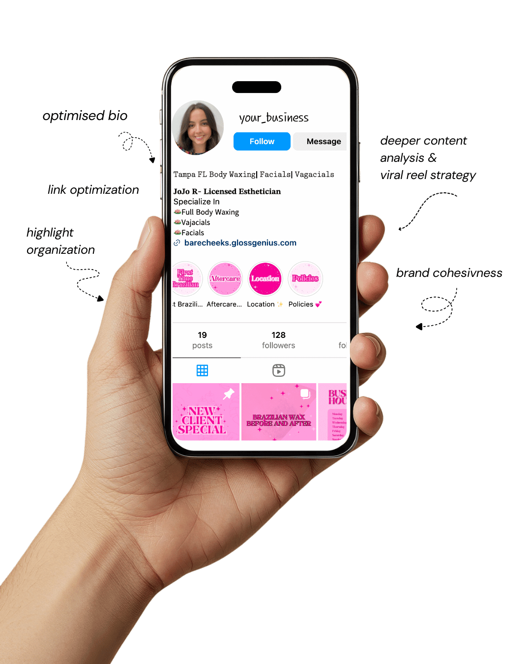
Your Instagram isn’t the problem.
The strategy is.
Get a free, honest audit of your Instagram profile — tailored for beauty, wellness & creative brands.
You’ll receive: profile fixes · content gaps · bio upgrades · content ideas.
I personally review your profile and send a clear, actionable breakdown — no AI, no templates.
If you’ve been looking for Canva design inspiration that actually elevates your brand, you’ve probably realized that not all templates are created equal.
Some look cluttered, overly trendy, or far too similar to what everyone else is already posting.
But neutral, minimalist layouts are different — they’re timeless, clean, and communicate a higher level of professionalism.
When crafted properly, a neutral Canva design can make your brand look like you hired an expensive agency, even if you’re designing everything yourself from home.
That’s exactly why these layouts matter, especially for creators, service providers, marketers, and small business owners who want to stand out without complicating their workflow.
The beauty of using a well-built neutral Canva design is that it doesn’t overwhelm the viewer. Instead, it creates visual breathing room that lets your message shine.
With the right spacing, typography, balance, and hierarchy, your designs will look polished, expensive, and “intentional,” even if you’re not a designer.
This guide breaks down 10 neutral Canva design layouts you can start using immediately — each crafted to help you get engagement, build brand recognition, and elevate your overall presence across Instagram, Pinterest, and other visual platforms.
Let’s get into why these layouts matter and how they can transform the way people perceive your brand.
Why Neutral, High-End Canva Designs Matter
Neutral layouts may look simple, but strategically, they are some of the most effective visuals you can create — especially when using Canva design for social media branding.
A neutral palette allows your message, photos, and typography to take center stage without battling for attention.
This is especially important for businesses that want their visuals to look modern, premium, and cohesive.
Clutter-free design reduces cognitive load, meaning viewers spend less time trying to decode what they’re
seeing and more time absorbing your message.
On platforms where people scroll fast, that clarity becomes a competitive advantage.
Another major benefit is that neutral Canva design layouts naturally fit into a broad range of industries — beauty, coaching, digital marketing, real estate, wellness, fashion, and corporate brands.
This flexibility means you can repurpose the same layout across campaigns without it feeling repetitive.
Additionally, neutral tones tend to look more expensive because high-end brands prioritize minimalism, balance, and subtle contrast over bright, chaotic visuals.
When you apply these principles to your Canva design workflow, your content instantly communicates credibility and trust.
Technically, neutral designs are easier to systemize into a content library or brand kit.
The simplicity allows faster editing, consistent spacing, and smooth cross-platform resizing — all crucial for efficient digital marketing.
1. Clean Editorial Layout with Strong Typography
An editorial layout is one of the best ways to elevate your Canva design instantly because it mimics high-fashion magazine spreads.
The foundation of this layout is typography — think bold serif headlines paired with simple sans-serif body text.
Combine this with generous negative space and you instantly achieve a luxury aesthetic.
Neutral backgrounds like cream, off-white, or soft beige ensure the text becomes the focal point without visual clutter.
A major technical detail many overlook is tracking (letter spacing) and line height.
Tight tracking on headlines gives a modern, bold look, while increased line height in body text improves readability and elegance.
Add subtle alignment shifts, like left-aligned headers with centered supporting text, to create movement without chaos.
Editorial layouts are perfect for Instagram posts, promotional graphics, and Pinterest pins because they feel premium, timeless, and structured — all qualities that set your brand apart.
2. Neutral Collage Moodboard Layout
A neutral collage-style layout gives your Canva design a high-end creative studio vibe. These layouts typically include a mix of soft-toned images, torn-paper textures, and minimal text placed intentionally.
The key is balance — avoid stuffing too many photos in one frame. Instead, choose two to four images with similar lighting, color temperature, and aesthetic. This keeps the collage cohesive rather than chaotic.
To elevate the look, add subtle overlays like cream-toned gradients, grain texture, or faint drop shadows behind elements.
These micro-details mimic the depth found in Photoshop while keeping the workflow simple. Neutral collage designs are ideal for brand moodboards, product showcases, or lifestyle-focused posts.
They help communicate your aesthetic, values, and brand energy without needing long paragraphs.
When used consistently, these collage layouts look like something crafted by a professional design agency.
3. Minimal Quote Card with Subtle Texture Background
A minimal quote card is one of the easiest Canva design layouts to master — but when done right, it can look incredibly luxurious. Start with an off-white or muted almond background.
Then, incorporate a very subtle texture such as linen, paper grain, or watercolor wash.
The key is to keep the texture nearly invisible; it should be felt more than seen. This detail alone immediately elevates the design.
Use a single elegant serif font for the quote, and pair it with a thin, airy sans-serif for the attribution. Keep the spacing generous and avoid bold colors.
Adding a soft border or frame in a taupe or gray tone adds extra refinement.
These layouts perform extremely well on Instagram and Pinterest because they’re clean, shareable, and aesthetically timeless. They also reinforce your brand voice with minimal effort.
4. Beige-Toned Carousel with Large Headline Sections
Carousels are still some of the best performing formats, and when you create them using neutral tones, your Canva design feels polished and premium.
Start with a beige or greige background. Incorporate oversized headlines with strong contrast — a charcoal, espresso, or muted black works perfectly.
Use large margins to keep the design airy, and apply consistent alignment throughout all slides.
The technical trick that makes these look professional is consistency in hierarchy: headline > subtext > microtext.
Maintain uniform font sizes across all slides, and use identical spacing between elements. Add thin line dividers or minimalist icons to guide the eye without clutter.
This structure makes the carousel visually appealing while keeping the content digestible. It’s ideal for educational content, tips, marketing insights, or product breakdowns.
5. Polaroid Photo Frame Layout
Polaroid-style frames are a timeless Canva design classic — especially when kept neutral. Use cream borders, soft shadows, and muted photo tones to create a cohesive look.
The trick is setting the shadow blur low and the opacity around 20% for a realistic, high-end finish. Tilt photos slightly or overlap them for a more organic magazine aesthetic.
This layout works beautifully for showcasing product photos, behind-the-scenes shots, or brand lifestyle images.
It adds visual storytelling without overwhelming the viewer. Pair the frames with handwritten script accents or tiny serif labels for an elevated feel.
Polaroid layouts also perform incredibly well on Pinterest because they exude a nostalgic yet modern vibe. When used consistently, they help create an approachable yet premium brand identity.
6. Luxe Minimal Landing-Page Style Graphic
If you want an agency-like edge, a landing page–inspired Canva design layout is powerful. Think large section dividers, oversized numbers, simple icons, and spacious formatting.
Start with a light taupe background, then add darker neutral blocks to break sections visually. This layout mirrors high-end web design, giving your content a structured, premium feel.
Use a mix of serif headlines and crisp sans-serif body text to create contrast. Keep the color palette narrow — two neutrals and one accent tone.
Add subtle drop shadows behind content blocks for depth, but keep them soft. This layout is excellent for promotional posts, service breakdowns, or launching new offers.
It communicates authority, organization, and intentionality — all qualities clients associate with high-level branding agencies.
7. Soft Gradient Neutral Background Layout
Soft gradients, when used carefully, can make your Canva design feel incredibly polished. Choose neutral gradients like beige-to-cream, taupe-to-ivory, or sand-to-white.
Keep the gradient direction subtle and consistent — diagonal gradients often appear more modern and aesthetic.
Pair the gradient with minimalist typography and a single focal image or headline. The gradient adds dimension without overwhelming the content.
Set transparency around 70–80% on gradient overlays to prevent harsh color transitions. You can also add faint noise texture for a matte, editorial finish.
These layouts work extremely well for announcements, product reveals, and promotional graphics.
Their softness draws the eye gently, making them both calming and high-end. This is a great way to achieve luxury aesthetics with minimal complexity.
8. Split Layout with Half Image, Half Text
A split layout is one of the most underrated Canva design structures, yet it instantly feels agency-level when executed well.
Split the canvas vertically or horizontally: one half for your image, the other for your message. Keep the text side minimal with plenty of whitespace.
Choose images with neutral lighting, beige tones, or soft shadows to maintain cohesion.
Use bold typography for your header, and keep body text small and neat. Maintain consistent padding around all edges — this is a detail many people forget, but it’s what makes the design look expensive.
You can add a thin line separator or a subtle shadow between the two sections for definition. This layout is perfect for service-based businesses, product ads, and brand storytelling posts.
9. Structured Grid Layout
Grid-based layouts are incredibly professional-looking and ideal for Canva design users who want structure.
These layouts divide your canvas into clean squares or rectangles, each holding either an image or a piece of text. Use neutral backgrounds and consistent spacing between grid lines for a sleek finish.
Technically, attention to alignment is everything. Use Canva’s exact pixel measurements instead of dragging elements by eye.
Keep all text within margins and apply uniform font sizes. This makes the entire design look cohesive and intentional.
Grid layouts are perfect for tutorials, product highlights, mini-portfolios, or step-by-step posts.
Their balance and order give the impression of high-level design knowledge — making your brand look far more premium.
10. Ultra-Minimal Hero Layout
If “luxury” were a single Canva design style, this would be it. Ultra-minimal hero layouts use maximum negative space to let one bold element stand out — usually a headline or a single image.
Start with a clean ivory or pale sand background. Place your headline in large, elegant serif typography, then balance it with a tiny subheading or small icon.
The key is restraint. Don’t fill empty space. The more breathing room you give your elements, the more expensive the design looks.
This layout is ideal for events, announcements, and brand statements. It’s extremely easy to adapt and maintain across multiple platforms, making it perfect for building a cohesive brand identity.
Additional Steps to Improve Your Canva Results
After exploring these neutral layout options, take your Canva design workflow further by implementing a few essential steps.
Start by building a brand kit inside Canva—upload your color palette, set your typography hierarchy, and save your go-to layouts.
This increases consistency and reduces design time dramatically. You can also create reusable content frameworks: for example, one for quotes, one for carousels, one for promotions, and one for aesthetic imagery.
Next, pay attention to export quality. Always export as PNG for clarity, and set resolution to 1080×1350 for Instagram posts.
If using gradients or textures, enable “Transparent Background” for certain overlays to avoid muddy compression.
Additionally, use Canva’s rulers, gridlines, and position tools to maintain perfect alignment — a technical detail that instantly elevates your designs.
Finally, study your analytics. Track what layouts perform best on Instagram, Pinterest, or your website.
Save the high-performing styles into a dedicated folder and build variations. This keeps your design aesthetic cohesive without becoming repetitive.
Over time, your audience begins to recognize your look instantly — which is exactly what strong branding should accomplish.
Final Words
Creating visuals that look professionally designed doesn’t require an agency or expensive software — especially when you understand how to use Canva design layouts intentionally.
Neutral design styles help you stand out, elevate your brand image, and communicate professionalism without overwhelming your audience.
The key is consistency: cohesive tones, aligned text, proper spacing, and thoughtful typography.
With the right approach, your feed, website, and marketing materials can look polished, premium, and strategically designed.
These neutral layouts give you a foundation you can use repeatedly while still customizing them for your brand personality.
Whether you’re a creator, entrepreneur, marketer, or small business owner, these concepts will help you create content that feels timeless, clean, and high-end.
If you want additional templates or need help creating brand-specific layouts, I can generate customized Canva design styles for you as well.