
Your Instagram isn’t the problem.
The strategy is.
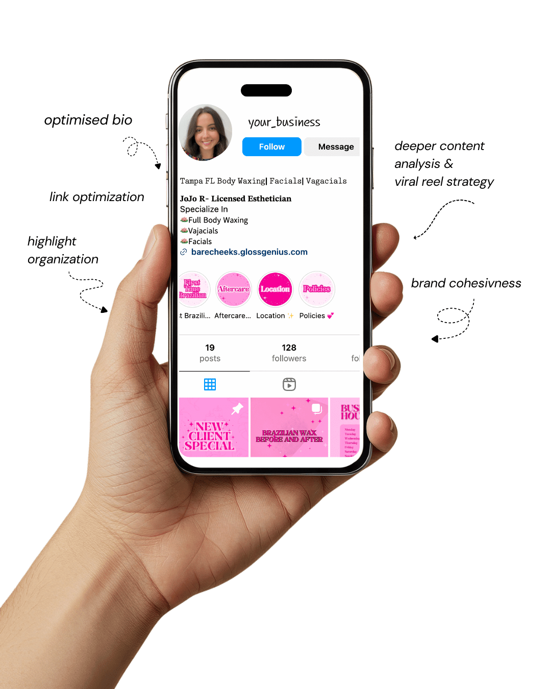
Get a free, honest audit of your Instagram profile — tailored for beauty, wellness & creative brands.
You’ll receive: profile fixes · content gaps · bio upgrades · content ideas.
I personally review your profile and send a clear, actionable breakdown — no AI, no templates.
In today’s digital era, an Instagram template is more than just a design shortcut — it’s a strategic tool that defines how your brand looks, feels, and connects with your audience.
Whether you’re a content creator, small business, or luxury brand, the way your Instagram grid looks instantly shapes how people perceive your value.
A polished feed tells your followers that you care about quality, detail, and consistency — three key traits associated with premium brands.
Designing everything from scratch can feel overwhelming and inconsistent, which is why using pre-made Instagram templates is a smart, scalable move.
Templates save hours of design time, ensure uniformity, and give you space to focus on creativity and storytelling.
With tools like Canva templates and other design software, you can tweak colors, typography, and image placement to perfectly align with your brand.
A great Instagram template doesn’t just look pretty — it communicates authority and intent.
Every element, from margins to font pairing, works together to make your brand appear more expensive, reliable, and desirable.
In this article, we’ll explore some aesthetic Instagram templates that can instantly elevate your visual identity, plus actionable tips for getting the best out of your design strategy.
Why Using Instagram Templates Is Essential for a Cohesive, High-End Brand

If you’ve ever looked at a brand’s Instagram feed and thought, “Wow, that looks professional,” chances are, they’re using an Instagram template.
Templates provide visual consistency — meaning your followers immediately recognize your posts without seeing your handle. That kind of recognition is what builds trust and brand memory.
From a design perspective, Instagram templates enforce alignment, spacing, and color balance — three fundamentals that even experienced designers emphasize.
Templates help you maintain proportion between image and typography, ensure readability on small screens, and create rhythm across your feed.
When these visual systems are in place, your brand starts to feel structured and dependable.
On a practical level, using an Instagram template saves you from constant design guesswork.
You can build content faster while ensuring it fits your aesthetic tone — modern, minimalist, feminine, luxury, or boho. Additionally, templates simplify collaboration.
If your team or virtual assistant designs posts, consistent templates keep everyone aligned with your brand guidelines.
What many miss are the technical advantages: using 1080×1080 px or 1080×1920 px dimensions for posts and stories, maintaining font licenses for brand safety, and compressing exports to 72 dpi for web quality.
When your visuals are technically correct and aesthetically coherent, your brand instantly looks premium — no design degree required.
25 Aesthetic Instagram Templates That Instantly Upgrade Your Brand
Each of these templates can be customized in Canva, Figma, or Adobe Express to match your brand’s fonts, colors, and vibe.
Think of them as creative frameworks — reliable systems that make your posts look cohesive, elevated, and unmistakably “on brand.”
1. Minimal Serif Grid Template
This Instagram template gives your feed a polished, editorial aesthetic. Using a timeless serif font (like Playfair Display or Libre Baskerville) instantly adds sophistication.
Keep a clean white or off-white background, use consistent padding (around 24 px), and align captions to your grid for visual order.
Perfect for high-end service providers, lifestyle influencers, or boutique brands that want to project quiet luxury.
2. Bold Color Block Carousel Template
Want your audience to swipe and stop? Alternate solid color backgrounds with product images or brand messages.
Stick to two contrasting shades from your palette to avoid visual clutter. Use hierarchy — bold headlines (around 90 pt) and smaller subtext (around 45 pt).
Keep about 10–15 px safe margins so the design doesn’t feel cramped on mobile. This Instagram template works wonders for product launches and promos.
3. Warm Neutral Editorial Template
A favorite among modern brands, this Instagram template combines warm beige, sand, and ivory tones with delicate typography for an editorial, magazine-like look. It’s ideal for wellness, skincare, or interior design brands.
Use soft drop shadows, subtle overlays, and muted tones to keep it elevated yet approachable.
Adjust brightness to maintain texture without losing warmth — this palette never feels cold or overly minimal.
4. Elegant Gold Frame Template
Nothing says luxury like gold accents done tastefully. A fine border (2–3 px, hex code #D4AF37) around your content adds understated glamour.
Keep the frame consistent across posts so your grid looks cohesive.
Avoid overusing gold — pair it with plenty of negative space and simple typography. This Instagram template is ideal for jewelry, fashion, or beauty brands that want to communicate exclusivity.
5. Lifestyle Storyboard Template
If you love storytelling, this layout turns your feed into a mini visual diary. Combine 3–4 candid images into one collage with consistent spacing (10–15 px gutters).
Use the same photo preset or filter to keep the tone uniform. It’s perfect for brand stories, behind-the-scenes posts, or lifestyle showcases.
A good tip: balance light and dark visuals so your collage feels intentional, not random.
6. Minimal Quote Card Template
A must-have for coaches, creators, and thought leaders. This Instagram template focuses on typography and space.
Use clean sans-serif fonts (like Poppins or Lato) on a solid or gradient background. Center your quote text and leave at least 20% white space.
Use your brand’s accent color subtly in the author’s name or border. The simplicity encourages shares and communicates professionalism.
7. Diagonal Split Layout Template
If your feed feels too static, this adds dynamic movement. Split the canvas diagonally into two halves — one neutral, one brand color. Use the bright half for callouts or bold text and the other for imagery.
This kind of composition creates a sense of energy without chaos.
Keep logo placement consistent (bottom right or top corner) so your Instagram template feels anchored.
8. Transparent Text Overlay Template
Overlaying a semi-transparent box (60–70% opacity) on photos creates perfect contrast for legible text. It’s great for photographers or content creators who want to post text without ruining image quality.
Always check text contrast using accessibility tools — it makes your posts both beautiful and readable. Stick to brand colors for the overlay so every post feels connected to your identity.
9. Patterned Border Template
This subtle design trick instantly makes posts feel custom. Add a thin border with faint geometric or dotted patterns at around 10% opacity.
It frames your image like a designer print, without overwhelming it. Works beautifully for lifestyle or stationery brands.
Always test the pattern scale on mobile — too small and it looks pixelated, too big and it distracts.
10. Split Grid Carousel Template
Ideal for storytelling posts or brand announcements. The concept: one image spans multiple carousel slides, creating seamless continuity.
Prepare your artwork in a wide 5400×1080 px canvas, then slice into 5–6 tiles.
This Instagram template encourages users to swipe, increasing engagement. Use consistent alignment so transitions between slides feel smooth, not jarring.
11. Textured Neutral Background Template
Instead of plain white, use textures like subtle paper grain or linen for depth. Textures add tactile warmth and make your visuals look more organic.
Keep opacity low (5–10%) so text stays the hero. Works perfectly for natural, eco-conscious, or artisanal brands.
Compress the texture file before upload — under 2 MB is ideal — to keep your post crisp and fast-loading.
12. Pastel Gradient Overlay Template
Gentle gradients (like blush pink to ivory or misty blue to lavender) feel soft, calming, and high-end. Keep transitions subtle and linear — no harsh edges.
Pair with thin sans-serif typography for balance. Gradients photograph well on both light and dark modes, making this Instagram template incredibly versatile for wellness and beauty brands.
13. Modern Collage Template
Collages add context to your story. Combine product close-ups, lifestyle shots, and text blocks within equal sections (12 px gutters). Maintain uniform color grading across all photos.
To elevate it further, use shadow overlays or subtle outlines around images for definition. This design works beautifully for fashion collections, interior inspiration boards, or campaign previews.
14. Branded Icon Template
Adding icons gives structure and familiarity. Use simple vector icons (max 48 px) for different post types — tutorials, tips, testimonials, etc. Place them in the same corner every time for visual rhythm.
Over time, followers learn to recognize your content just from the icon, strengthening brand recall. Keep it minimal: consistent color, line weight, and padding.
15. Bold Typography Hero Template
This design proves that words can be your visuals. Use an extra-bold font (700+ weight) with tight kerning and brand-color highlights. Keep your copy short — 3 to 5 impactful words max.
This Instagram template is great for statements, launches, or quotes that represent your brand voice. Ensure readability by testing in both light and dark modes before posting.
16. Half-Image Split Template
Divide the post into equal halves: one side for imagery, one for text. Keep a neutral background behind text to ensure clarity. Ideal for announcements, blog previews, or campaign launches.
Maintain equal visual weight — if the image is detailed, simplify the text area. Consistent placement across multiple posts ties your feed together elegantly.
17. Product Feature Template
A must for e-commerce brands. Display one product centered on a neutral background with a soft shadow for realism. Include a concise caption or benefit in a clean typeface.
Add a tiny watermark or logo (5% opacity) in one corner for brand protection. Keep all lighting consistent across products for an editorial-quality look.
18. Story Template with Swipe-Up Cue
Stories are where conversions happen. This 1080×1920 px layout keeps your visuals tall, balanced, and clickable. Use a clear “Swipe Up” or “Link in Bio” visual cue with arrows or motion lines.
Maintain 88 px safe zones on top and bottom to avoid UI overlap. This Instagram template boosts CTRs by guiding users visually toward the next step.
19. Seasonal Adaptation Template
Keep your structure the same but change accents — warmer tones for autumn, soft hues for spring. This keeps your brand relevant without disrupting the grid.
Save each seasonal variation as a separate style file in Canva so you can switch themes effortlessly. It’s a clever way to stay fresh while maintaining brand familiarity.
20. Testimonial Card Template
People trust people. This Instagram template highlights client testimonials beautifully. Use a neutral background, client headshot in a circle, and short quote in italic font.
Place the client’s name in brand color to make it pop. Maintain identical layout spacing (12–16 px gutters) for consistency across all testimonial posts.
21. Countdown Template
Build excitement with minimalist countdowns. Use bold numerals (200 pt+), contrasting background, and small secondary text below.
Avoid clutter — the focus is the countdown itself. If using animation in stories, use smooth transitions. Keep all elements within safe margins to ensure nothing gets cropped when posted.
22. Interactive Q&A Template
Engage followers directly with branded Q&A cards. Keep your background in brand colors, headline centered, and space below for text responses or stickers.
This Instagram template is perfect for community building or weekly interactions. To keep things uniform, lock text boxes and spacing before duplicating for new questions.
23. Portfolio Display Template
Showcase your best work with a clean gallery layout — one hero image, three smaller thumbnails below. Maintain a consistent color grade and spacing (4 px gutters).
Use thin outlines to define sections. Ideal for photographers, designers, and agencies who want to present work like a digital exhibition.
24. Blog or Carousel Cover Template
Your first slide sets the tone for the entire carousel. Keep it consistent: headline on top (120–150 pt), subheading beneath, and logo bottom right.
Stick to one accent color and neutral background. This structure ensures your brand posts look unified even when the topics vary.
25. Announcement or Event Template
Perfect for launches, pop-ups, or workshops. Use a balanced mix of imagery and bold headline typography. Include key info like date, time, and RSVP clearly within the safe zone.
Keep it consistent with your grid style — same fonts, same alignment.
This Instagram template makes every announcement look like a big deal without feeling overdesigned.
Steps to Improve Results Beyond Templates
Even with the best Instagram templates, your visual system needs thoughtful management to maintain consistency:
1. Build a Brand Style Guide.
Document your brand colors (with hex codes), typography hierarchy, logo placement rules, and grid spacing. This ensures that every future post aligns perfectly.
2. Optimize for Resolution and Speed.
Always export posts at 72 dpi and under 2 MB. Use sRGB color profile for accurate online rendering. Blurry or slow-loading visuals immediately lower perceived value.
3. Maintain Consistent Editing.
Use the same preset or filter for all imagery. Consistency in lighting, tone, and texture keeps your Instagram template system cohesive.
4. Preview Your Grid Before Posting.
Use a feed planner app to visualize how each post aligns. A seamless top-down flow gives your brand the “expensive” magazine-layout look that stands out.
Final Words
Your brand’s visual identity is often your first impression — and with the right Instagram template, that impression can be one of luxury, precision, and confidence.
Templates make your feed look curated and intentional, even if you’re not a designer.
By choosing high-quality layouts, following correct sizing and technical standards, and keeping every element consistent, you can elevate your brand instantly.
Remember: professional doesn’t mean complicated. The magic lies in details — consistent colors, balanced typography, and thoughtful composition.
Start small, experiment with these templates, refine as you go, and watch your Instagram transform into a high-end visual story your audience can’t scroll past.