
Your Instagram isn’t the problem.
The strategy is.
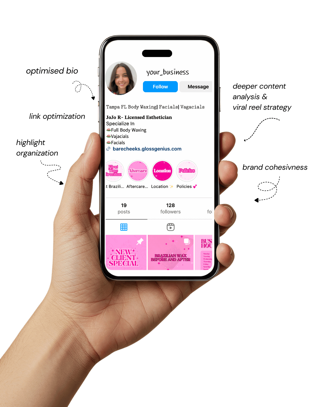
Get a free, honest audit of your Instagram profile — tailored for beauty, wellness & creative brands.
You’ll receive: profile fixes · content gaps · bio upgrades · content ideas.
I personally review your profile and send a clear, actionable breakdown — no AI, no templates.
If you’re an esthetician looking to elevate your social feed, you’ll appreciate how well-crafted Canva Instagram templates can transform your brand presence.
These templates offer a plug-and-play solution to design, allowing you to maintain aesthetic harmony across posts without starting from scratch each time.
Whether you’re showcasing before-and-after photos, promoting a seasonal facial special, or sharing skincare tips, the right template helps you stay consistent, look professional, and attract new clients.
With the vast number of estheticians on Instagram, standing out means combining visual polish with a clear message — and that’s where Canva Instagram templates shine.
You’ll save time, reduce design stress, and ensure your feed aligns with your medspa-style brand, all while keeping your focus on what you do best: skin care.
Why Using Canva Instagram Templates Matters for Your Esthetician Brand
Implementing ready-made Canva Instagram templates is more than just making pretty posts — it’s about brand cohesion, audience trust and efficient workflow.
First, consistent design signals professionalism; clients judge your aesthetics as a reflection of your service.
When every post uses the same color palette, typography and layout, you reinforce your brand identity.
Second, templates streamline your content creation process — no more starting with a blank canvas, resizing images manually or guessing font pairings.
Third, the correct technical settings (for example, 1080 × 1080 px resolution for Instagram posts or 1080 × 1920 px for Stories, saved as PNG for sharpness) mean your visuals render crisply across devices.
Finally, when your templates are crafted with your target audience in mind — such as women 25-45 interested in skincare — you’ll speak visually to their tastes and motivations.
1. Minimalist Monochrome Treatment Template
Minimalist designs never go out of style — and for estheticians, this layout communicates refinement, trust, and quiet confidence.
The black-and-white aesthetic paired with a single accent hue (champagne, taupe, or sage) reflects calmness and premium care.
In Canva, save your accent shade in the Brand Kit and apply it to all future posts to ensure harmony.
Stick to high-contrast combinations — dark charcoal text on white background or soft beige overlays on black photos.
Use clean serif fonts like Playfair Display for titles and Lora for smaller text to create a magazine-like editorial tone.
Align elements precisely using Canva’s “Position” tools, and maintain white space between text blocks to avoid visual clutter.
Export your design as PNG (1080 × 1080 px) for the sharpest rendering. This style isn’t just visually pleasing — it signals to clients that your brand values precision and timeless sophistication.
2. Soft Pastel Before-and-After Layout
Transformation posts are a staple in any esthetician’s feed — but presentation matters as much as results.
Use soft pastel backgrounds (powder pinks, creams, light sage) to highlight your client’s glow rather than overpower it.
Create side-by-side layouts in Canva using Grids or Frames, keeping facial alignment consistent between “Before” and “After” photos.
Add a thin dividing line (1–2 px) in a muted tone — gold or silver works beautifully — to create separation without harsh contrast.
Label the halves using an elegant serif or script font, and ensure both images are balanced and cropped similarly.
Pro tip: upload high-resolution images, then export your design as PNG (not JPG) to maintain clarity when zoomed in.
This style not only elevates your professionalism but also turns simple transformation posts into visual testimonials that attract new clients instantly.
3. Bold Typography Testimonial Feature
Social proof is gold in the beauty industry. A well-designed testimonial post can act like a word-of-mouth recommendation — visually amplified.
Opt for a bold, clean typeface such as Montserrat Extra Bold for the quote and Open Sans Italic for the client’s name.
In Canva, ensure your quote sits within a safe margin (about 90 px) on all sides to avoid cropping on Instagram’s grid view.
Use the transparency slider (set around 40%) to add your logo watermark subtly at the bottom corner.
Consider overlaying your client’s review on a soft blurred spa background — perhaps a towel texture or plant leaf pattern — with low opacity.
The goal: a balance between readability and luxury. Strong typography conveys confidence, while subtle brand details reinforce credibility and cohesion across your feed.
4. Seasonal Offer Promo Frame
Limited-time offers deserve layouts that feel special without being pushy. Think elegant restraint — muted tones with a metallic overlay (rose gold, platinum, or pearl gradients).
In Canva, layer your photo and apply a “Gradient Overlay” (60% opacity) to make white or gold text stand out.
Include key promo elements: offer percentage, validity dates, and a bold CTA like “Book Now” or “Claim This Offer.”
Choose a square format for feed posts and vertical for stories (Canva makes resizing easy with “Resize → Copy & Resize”).
Always keep your logo visible, but secondary to the message. These posts perform best when they look exclusive — not salesy — so avoid clutter and rely on minimalist elegance.
Clients are drawn to clean, calm visuals that echo the experience you provide.
5. Product Spotlight Carousel
Showcase your retail line or skincare recommendations through a 5-slide carousel that tells a story: Problem → Solution → Ingredients → Benefits → CTA.
Start with a consistent header and matching product shot placement across all slides. Canva’s “Duplicate Page” feature ensures uniformity.
Add a faint background gradient or brand-colored overlay to tie the slides together visually. Include ingredient highlights or usage instructions in simple icons (e.g., sun for AM, moon for PM).
The last slide should feature your booking info or a CTA: “DM to order” or “Available at our spa.”
Tip: export as individual 1080 × 1080 PNGs, upload sequentially, and preview the swipe flow before posting — the rhythm between slides impacts engagement.
6. Treatment Menu Highlight Post
Think of this as your digital brochure — sleek, balanced, and easy to skim. Create a two-column design: one side for visuals (like a serene spa image), the other for text.
Use Canva grids for perfect symmetry and maintain clear typographic hierarchy:
- Treatment Name: 36 pt bold serif
- Description: 22 pt light sans-serif
- Price: 18 pt italic accent
Subtle details matter. Add a faint background texture (linen, marble, or quartz) to enhance depth without distraction.
Use consistent spacing and save as JPG for slightly faster upload speeds without noticeable quality loss.
7. Wellness Tips Infographic Style
Educational content builds authority — and infographics make it easy to share insights visually. Use portrait orientation (1080 × 1350 px) to occupy more vertical space in the feed.
Break complex skincare concepts (like “Understanding SPF” or “Daily Hydration Tips”) into 3–5 digestible points.
Canva’s “Chart” or “Icon” elements can replace long text blocks for better readability. Group visual elements so resizing doesn’t misalign them.
Use your brand colors strategically — one tone per section to guide the eye naturally. Infographics not only improve engagement but can also position you as the go-to skincare expert in your niche.
8. Brand Story “Meet Me” Template
Clients want to know the professional behind the treatments. This template lets you humanize your brand while keeping things sleek.
Include a circular headshot framed with a soft glow effect, a short mission statement, credentials, and a personal note about your passion for skincare.
In Canva, use the “Frame” tool for the circular crop and a muted gradient background that complements your brand palette. Keep text legible — dark grey on ivory or gold on white feels luxurious.
Pro tip: Add small icons to visually summarize expertise (like a diploma icon for certifications or sparkle icon for 10+ years of experience). Personal yet polished — that’s the goal.
9. IG Stories Quiz Slide
Engagement is everything. Quizzes like “What’s your skin type?” or “Which facial is best for you?” invite interaction and boost algorithmic visibility.
Canva’s animated GIFs and “Stickers” make your Story feel dynamic and fun.
Ensure that your text and tappable areas are centered (safe zone: 250 px from edges). Choose bright accent colors for answers so users instinctively tap them.
Export as MP4, since Instagram compresses GIFs poorly.
Animated slides also perform better when layered with upbeat background music and concise captions. Done right, this isn’t just a game — it’s lead generation disguised as fun.
10. Before/After Grid with Consistent Borders
Your transformation photos should look intentional, not accidental. Create uniform borders — about 20 px wide — in your accent color for all before-and-after posts. This consistency makes your grid feel cohesive.
Apply subtle shadow effects (Canva → Edit Image → Shadows) to lift photos slightly from the background. Label each half cleanly with uppercase serif fonts and keep lighting balanced across both photos.
Save each as PNG for crisp results and rename files descriptively (“BeforeAfter_Microneedling2025.png”).
Visual consistency builds trust — clients subconsciously associate polished visuals with professional service quality.
11. Client Review Highlight Reel Template
Turn screenshots of reviews into branded visuals that feel intentional. Use a tall Story format (1080 × 1920 px) with a soft background gradient.
Import the review image, add a subtle drop shadow, and include your logo and a call-to-action like “Book Your Glow.”
In Canva, align elements centrally and use heart or sparkle icons sparingly to enhance authenticity. Ensure readability — white text on a muted beige or blush background looks modern and soothing.
Convert this post to a Story Highlight cover afterward — so new visitors can easily find all your client love in one place.
12. Monthly Newsletter Cover Post
Think of this like a beauty magazine cover for your business. Include a headline (e.g., “October Glow Report”), secondary subheads (like “Top Facials” or “Autumn Skincare Tips”), and a hero photo of your spa or products.
Use Canva’s grid layout to structure content cleanly. Keep the main title locked in place each month for consistency, just change background images and feature topics.
This approach gives your feed a professional, editorial look — perfect for businesses that want to establish themselves as skincare authorities rather than just service providers.
13. Skincare Routine Step-By-Step Slide
This carousel helps clients visualize their at-home regimen. Dedicate each slide to a step: Cleanse, Tone, Treat, Moisturize, Protect.
Use icons or product photos, and maintain uniform spacing between text and images.
Apply gradient bars or numbered circles to indicate progression. In Canva, group recurring elements so they stay consistent when you duplicate slides.
Your tone should be educational yet inviting — think “beauty coach meets expert.” These templates increase shareability and position you as a trusted skincare educator.
14. Behind-the-Scenes Studio Shot Overlay
Show your audience what professionalism looks like in action — your studio setup, sterilization process, or product display. Overlay text like “A Day in the Spa” or “Our Glow Rituals.”
In Canva, apply a semi-transparent overlay (40–50%) using rectangles for legible white text. Add fade-in animations for stories to make transitions natural.
These posts build authenticity — clients see the real environment and the care you put into each treatment, increasing emotional trust and relatability.
15. Limited Seats Countdown Post
Scarcity drives action, but it should still look elegant. Use Canva’s “Countdown Timer” or number icons with your brand font. Center the message: “Only 3 Spots Left!” on a minimal background.
Avoid bright reds — opt for gold, deep taupe, or muted coral to stay on-brand. Add a faint gradient to make numbers pop.
Schedule this post strategically — 72, 48, and 24 hours before the deadline. Subtle urgency feels exclusive, not pushy, which is key for high-end beauty brands.
16. Skin Facts and Myth Buster Carousel
Debunking skincare myths is educational content gold. Create 4–6 slides alternating between “Myth” and “Truth.” Use contrasting tones — perhaps blush for myths, ivory or cool grey for truths.
Use Canva’s alignment guides to ensure headers and icons line up identically across slides. Add your logo watermark bottom-right to reinforce branding.
This not only builds engagement but also positions you as an authority — a trusted esthetician who educates with style.
17. Holiday Special Design (Valentine’s, Mother’s Day)
Seasonal designs don’t have to look cliché. Use Duotone filters in Canva to recolor stock images into your palette — for example, rose duotone over florals for Valentine’s.
Keep text centered and concise. Add an overlay ribbon or bow graphic for festive touch but avoid overpowering visuals.
Reuse the layout annually by simply replacing images and dates using the “Replace Image” shortcut.
Timeless design reduces workload and ensures your promotions always look cohesive with your existing feed.
18. Client Journey Process Diagram
This template visualizes your professional process, boosting client understanding and confidence. Design a clean flowchart — Consultation → Treatment → Aftercare — using Canva’s line connectors and circular nodes.
Keep spacing equal and label each step clearly. Apply your brand accent color to the flow lines. Once aligned, lock all elements (Object Lock) to prevent accidental movement during edits.
This diagram not only looks professional but also simplifies complex processes, helping new clients understand what to expect from their first visit.
19. Before/After Highlight with Sticker Accents
Add a touch of fun to your transformation posts. Incorporate Canva’s animated stickers (✨, 💧, 🌿) but use sparingly to maintain class. Place them at image corners or alongside captions like “Instant Glow” or “Real Results.”
Balance movement with minimalism — too many animations can distract. Ensure text never overlaps the client’s face or results. Export as MP4 for Instagram to keep animation smooth.
This adds a dynamic feel while keeping your luxury aesthetic intact.
20. Collaboration Announcement Template
Partnerships boost credibility and reach. Use a 50/50 split layout — one side featuring your collaborator, the other your brand. Insert divider lines or shared logos for symmetry.
Canva’s Smart Guides help align everything perfectly. Include both logos at equal scale and use captions like “Partnered for Radiant Skin” or “In Collaboration With.”
This type of post demonstrates growth and industry trust, positioning you as a connected professional in the skincare space.
21. Freebie Download Promo Post
Offering free resources (eBooks, skincare checklists) attracts followers and potential clients. Create a realistic Smartmockup of your digital guide in Canva to show what they’ll receive.
Keep the background simple — plain marble or soft nude — so the focus stays on the mockup. Add a clear CTA (“Download via Link in Bio”).
These posts are great for lead magnets — turning followers into email subscribers. Always maintain your brand fonts and colors so freebies seamlessly match your Instagram style.
22. Event Recap Post Template
After hosting an event, don’t let the momentum fade. Use Canva’s photo collage grids (1 large + 3 small) to display highlights. Add overlay banners like “Thank You” or “Glow Event 2025.”
Match the color scheme to your event decor for continuity. Incorporate candid shots — laughter, group photos, spa ambience — to humanize your brand.
These posts nurture community connection and make followers feel included, even if they couldn’t attend.
23. FAQ Highlight Slide
Turn recurring client questions into beautiful, informative slides. Use bold serif fonts for questions and lighter sans-serif for answers. Space lines generously (1.4–1.6) to keep text breathable.
Include icons (like 💬 for Q&A or ❓for questions). Canva’s grouping tool ensures elements move together while editing.
This not only saves you time repeating answers in DMs but also demonstrates your willingness to educate and guide — a subtle trust builder.
24. Testimonial Video Template
Video content is king. Use a 1080 × 1080 template with upper and lower banners in brand colors. Drop in your client video, add light captions, and export as MP4 (H.264 codec) for optimal Instagram quality.
Keep captions large and centered — many users watch without sound. You can also add a fade-in intro (“Real Client Results”) for professionalism.
Video testimonials convert exceptionally well because they feel authentic — real voices, real stories.
25. Countdown to Launch Template
Build anticipation before unveiling a new product or service. Create three matching posts — “3 Days,” “2 Days,” “1 Day.” Duplicate your Canva design to ensure exact alignment.
Add subtle animations like Fade In or Slide Up transitions to make posts feel alive. Keep copy short: “Something glowing is coming.”
This simple visual countdown not only builds excitement but also creates rhythmic content flow leading to your big reveal — increasing engagement and anticipation.
Steps to Improve Results with Canva Templates
Even the most stunning Canva Instagram templates perform better when combined with strategy. Here are some advanced tweaks to boost engagement and conversions:
A. Track Performance:
Monitor which templates drive the most likes, saves, or DMs. Use Instagram Insights to identify patterns and reuse winning formats.
B. Brand Kit Consistency:
Upload your logo, fonts, and color HEX codes to Canva’s Brand Kit. This keeps your look consistent automatically — essential for memorability.
C. High-Resolution Images:
Avoid blurry visuals. Always upload original photos at 300 dpi or higher, then export in PNG for posts and MP4 for motion stories.
D. Captions That Match Design:
Pair each visual with an intentional caption. A luxury visual loses impact if the text doesn’t align in tone or message.
E. Refresh Quarterly:
Audit your feed every 3–6 months. Update color accents seasonally, refine layouts, and replace outdated icons to keep things fresh and relevant.
With these adjustments, your templates become more than visuals — they become strategic assets for your esthetician brand.
Final Words
Your online presence is your first impression — and with the right Canva Instagram templates, you can make it flawless.
Each of these luxury layouts was designed to help estheticians present their work with elegance, educate clients visually, and promote their services without design overwhelm.
By combining intentional design, consistency, and authentic messaging, you’ll turn casual scrollers into loyal clients. Remember: you don’t need to reinvent your brand daily — just refine and repeat with excellence.
So open Canva, set up your brand kit, customize these templates, and start posting confidently.
The effort you invest today in branding clarity will pay off with trust, recognition, and a growing, loyal audience who sees your spa as the go-to destination for skin confidence.