
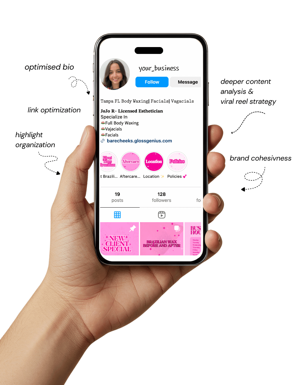
Your Instagram isn’t the problem.
The strategy is.
Get a free, honest audit of your Instagram profile — tailored for beauty, wellness & creative brands.
You’ll receive: profile fixes · content gaps · bio upgrades · content ideas.
I personally review your profile and send a clear, actionable breakdown — no AI, no templates.
In a digital world overflowing with visuals, the right Canva design ideas can make the difference between blending in and standing out.
Whether you’re a creator trying to grow your audience, a small business owner building a brand, or someone just discovering Canva’s potential, design quality speaks louder than words.
Every post, banner, or thumbnail you create tells your story — and the more polished and consistent it looks, the more people trust and remember you.
What’s great about Canva is that it doesn’t require a design degree. With just a few creative ideas, you can produce scroll-stopping graphics, professional brand materials, and social posts that look expertly made.
The trick lies in understanding design trends, learning the right dimensions, color harmony, and export settings, and knowing when to keep things simple versus bold.
These trending Canva design ideas don’t just make things look pretty — they communicate your message clearly and consistently.
The goal is simple: make your audience pause, look, and feel something. Once you do that, your visuals start doing the heavy lifting for your brand.
Why mastering Canva design ideas matters
Strong visual design is no longer optional — it’s the foundation of online communication.
When someone lands on your feed or website, your visuals are often the first (and sometimes only) impression they get.
The right Canva design ideas bring structure, consistency, and storytelling together in a way that text alone can’t.
Good design builds trust. Think of your colors, fonts, and layout as the visual DNA of your brand. When those elements stay consistent, people subconsciously associate them with quality.
Canva helps you achieve that by offering reusable templates, brand kits, and precision alignment tools.
For example, creating a consistent color palette and uploading it to your Brand Kit saves you hours later — no guessing, no mismatched tones.
On a technical level, Canva simplifies details that professionals obsess over — resolution, compression, typography hierarchy, and visual spacing.
Exporting at the correct file type (PNG for web, PDF for print, MP4 for motion) ensures your work looks crisp on every platform.
That blend of creativity and attention to detail is what separates amateur designs from brand-elevating visuals.
1. Bold Minimalism for Instant Impact
Minimalism in design isn’t just a style trend — it’s a communication strategy. The essence of this approach lies in clarity and visual breathing room.
By removing clutter, you allow the viewer’s attention to focus on what truly matters: your message.
In Canva, begin with a 1080×1080 px square canvas or a 1920×1080 px rectangle for broader visuals. Select a neutral or monochrome background, such as soft beige, muted gray, or off-white — these tones create calmness and sophistication.
Then, pick one accent color that embodies your brand identity. For instance, a deep cobalt blue signals reliability, while coral conveys energy.
Typography is the anchor of minimalist design. Use a single sans-serif font (like Montserrat or Open Sans) in large sizes — around 120 pt for headers and 48 pt for subtext.
Maintain consistent line spacing (1.2–1.4) for legibility and symmetry. Grids and rulers in Canva help align text perfectly, ensuring no element feels “off-balance.”
If you choose to include imagery, opt for one striking visual or geometric shape instead of a collage. For instance, a single circular photo cropped with Canva’s “Frame” tool can act as your focal point.
Remember, minimalism doesn’t mean empty — it means intentional. Every pixel should serve a purpose, whether to guide the eye, add contrast, or emphasize hierarchy.
2. Dynamic Split-Screen Layouts
Split-screen designs are one of the most effective ways to deliver two messages at once — perfect for comparisons, product highlights, or storytelling.
They also help maintain visual interest while keeping the layout balanced.
In Canva, divide your canvas vertically or horizontally using grids or shape blocks. Assign one half to imagery (for emotional appeal) and the other to text (for information).
This format works beautifully for before-and-after visuals, product vs. benefit comparisons, or campaign teasers.
Color choice is critical here. Use complementary yet contrasting tones — for example, navy blue paired with soft peach, or forest green with beige.
The contrast draws attention, while the harmony keeps it visually comfortable. To soften the division, add a gradient overlay or transparent line (around 20% opacity) between the halves.
Experiment with Canva’s frame layering tools to merge sections subtly — perhaps have the image bleed slightly into the text side.
For added depth, apply a faint drop shadow (transparency around 80%) on key text. This technique makes flat designs feel dimensional and modern — perfect for digital ads, website banners, and social media intros.
3. Animated Social Media Posts
Animation captures attention faster than any static image. It triggers curiosity, making users pause and engage — something every creator and business wants.
Canva makes this easy with its built-in animation presets like “Rise,” “Pan,” or “Drift.”
When animating, focus on storytelling flow. Begin with a hook slide that introduces your message in bold typography, followed by supporting visuals or icons.
Keep animation speed between 0.8–1.2 seconds per movement — enough to be noticed but not distracting. Limit to one animation per layer (for example, make text fade in while the background slides).
Use motion intentionally. For quote graphics, animate only the quotation marks or author name. For promotions, animate your CTA (“Shop Now,” “Read More”) subtly to draw the eye.
Remember that users skim fast, so ensure your message is visible within the first 3 seconds.
When exporting, choose MP4 (for Instagram Reels, TikTok, or Pinterest Idea Pins) at 1080×1920 px resolution.
If you’re designing GIFs, ensure they’re under 15 MB for quick load times. Animation, when done right, turns ordinary posts into eye-catching moments that boost engagement metrics significantly.
4. Infographic Templates That Educate and Convert
Information design is powerful because it transforms data into a story people actually want to read. Canva’s pre-made infographic templates give you structure, but personalization makes them perform.
Start with a vertical layout (1080×1920 px) to ensure mobile readability. Break your design into three to five sections — each with a clear headline, supporting icons, and short text.
Maintain a visual rhythm using Canva’s “Spacing” and “Group” tools.
Color-coding helps the viewer process information quickly. For instance, use a single accent color to highlight key stats (like 78% or “Top 5 Tips”).
Avoid overcrowding — aim for one key idea per section. Replace bullet points with icons or small vector illustrations from Canva’s Elements library to make data more visual.
Typography hierarchy matters here. Use bold sans-serif fonts (around 72 pt) for numbers, 48 pt for section titles, and 28–32 pt for explanations.
Export as PNG for web or PDF for downloads. If creating Pinterest infographics, increase vertical length to 800×2000 px for maximum reach.
Infographics are perfect lead magnets — pair them with a caption like “Save this for later” to encourage shares and saves.
5. Vertical Pinterest Graphics That Drive Traffic
Pinterest is where design meets discovery. A well-made pin can drive long-term traffic for months, making it a goldmine for creators and entrepreneurs. Vertical pins work best since they fill more of the user’s screen.
Use a 1000×1500 px canvas, ideally with an aspect ratio of 2:3. Start with a high-quality vertical photo that captures the vibe of your topic — lifestyle, workspace, product, or tutorial.
Overlay text in a clear, bold font (60–90 pt) positioned near the upper third for visibility.
A key detail many overlook: add a translucent overlay behind text (10–15% opacity) to ensure contrast and readability, especially when your background is busy.
Keep your design clean and legible even when viewed as a thumbnail.
Branding is crucial. Include your logo or website URL at the bottom (in 24 pt text) to build recognition and prevent content theft.
Export as PNG-24 for crisp detail and avoid heavy filters that distort color accuracy. Consistent Pinterest visuals establish your visual identity, and over time, your pins become instantly recognizable in users’ feeds.
6. Cohesive Instagram Carousels
Instagram carousels allow storytelling in swipeable form — a brilliant tool for building depth in your message. The key lies in maintaining visual consistency and flow.
Start with a 1080×1350 px template (the optimal size for portrait posts). Design your first slide as a strong hook — something that makes users want to swipe, such as a bold statement or intriguing question.
Use Canva’s “Duplicate Page” function to ensure each following slide retains alignment, color, and typography.
For continuity, use visual bridges — elements that stretch slightly between slides (like a line, shape, or photo edge).
This trick creates a seamless flow when users swipe. Limit your color palette to two primary and one accent shade. Fonts should stay identical across all slides.
Include a clear CTA on the last slide, like “Follow for more tips” or “Visit our site.” Export as individual PNGs to preserve image clarity.
Cohesive carousels are algorithm-friendly because users spend longer engaging with them — which Instagram rewards with higher reach.
7. Branded Mockups and Product Showcases
Mockups bring your designs to life, helping your audience visualize the product in real-world context. Canva’s Smartmockups feature integrates this functionality seamlessly.
Upload your logo, design, or label artwork, then insert it into mockups like apparel, packaging, or devices.
Adjust scaling and positioning precisely using Canva’s handles. For best realism, fine-tune the transparency (85–90%) so natural textures of the product — fabric or metal — remain visible.
Lighting makes a huge difference. Choose mockups with soft shadows and neutral backgrounds; harsh lighting can make products look fake.
For e-commerce, export at 300 dpi and save as PNG with transparent background.
You can also layer text or badges like “New Arrival” or “Limited Edition.” For service-based businesses, showcase portfolio pieces on digital screens (like a laptop or smartphone mockup).
It instantly upgrades your professionalism without external editing tools.
8. Aesthetic Quote Graphics
Quotes are one of the simplest yet most powerful content types for building engagement. People save and share them because they’re relatable and inspiring — and with the right design, they also build your brand authority.
Choose a square (1080×1080 px) layout, start with a textured, gradient, or blurred photo background, then apply a duotone filter to unify the mood. Canva offers presets under “Edit Photo → Filters → Duotone.”
For typography, combine serif fonts (for personality) and sans-serif fonts (for clarity). Example: Playfair Display for quotes, Lato for attribution.
Center-align text and maintain ample padding (at least 60 px per side). High contrast is vital — light text on dark backgrounds or vice versa.
To reinforce branding, subtly include your logo or handle at the bottom corner. Save as a reusable template, so you can quickly replace text weekly while maintaining consistency.
This approach builds recognition — people begin associating that look with your voice.
9. Consistent Brand Kits for Visual Harmony
Consistency is what separates polished brands from forgettable ones. Canva’s Brand Kit feature allows you to systemize your visual identity so every design — from Instagram post to presentation — feels cohesive.
Upload your color palette in HEX codes (primary, secondary, and accent tones). Then add your brand fonts — one for headings, one for body text.
Canva will automatically apply these styles in future designs, saving massive time and keeping your feed uniform.
Also, upload multiple logo variations (horizontal, stacked, icon-only) so you can quickly adapt to different formats.
For typography, use size hierarchy — 120 pt for headers, 60 pt for subheads, 36 pt for body — and lock it into your templates.
Whenever you design, toggle your Brand Kit styles directly from the side toolbar. When exporting, use transparent backgrounds for logos, so they integrate seamlessly into new visuals.
This habit ensures every touchpoint — online or offline — feels unmistakably you.
10. Data-Driven Thumbnails and Visual Hooks
A powerful thumbnail or ad visual doesn’t happen by chance — it’s data-informed design. Platforms like YouTube and Facebook compress images, so optimizing clarity and contrast upfront is essential.
Start with 1280×720 px canvas size. Use expressive imagery (especially faces with emotion) — thumbnails featuring people typically outperform text-only designs by over 40%. Place the face slightly off-center and text on the opposite side for balance.
Keep text concise: no more than five words. Use thick fonts like Anton or Bebas Neue and add subtle outlines or drop shadows (60–70% transparency) to ensure readability even on mobile.
Canva’s grid overlay helps position elements within the “safe zone” so they don’t get cropped.
File optimization matters. Export as JPG, keeping the file under 200 KB for faster loading without losing detail.
Then, test multiple versions using Canva’s Version History — change color, layout, or expression slightly and track which performs better.
These micro-optimizations compound: sharper, emotionally engaging thumbnails boost click-through rates, traffic, and ultimately brand growth.
How to push your Canva results even further
Design isn’t just about creating — it’s about refining. To elevate your Canva design ideas, start by understanding each platform’s size standards. For example, Instagram carousels need 1080×1350 px, while Pinterest prefers 1000×1500 px. Creating separate templates for each saves future resizing headaches.
Next, prioritize export quality. Use PNG-24 for web visuals, PDF Print (CMYK) for offline printing, and MP4 for animations. Reduce file size with Canva’s compression option if your uploads lag.
Add structure by working with grids and alignment lines. They ensure symmetry, balance, and professional polish. When choosing fonts, limit yourself to two families — one for headlines and one for body text — to avoid visual noise.
Finally, analyze performance. Track which posts or pins perform best and adjust accordingly. The most successful creators treat Canva as a live testing tool, not just a design platform.
Final Words
Great design doesn’t just catch the eye — it earns attention. With these Canva design ideas, you’re not just decorating your content; you’re shaping how your audience perceives your brand. Each layout, color choice, and animation builds trust and tells your story.
Keep experimenting and refining. The more you design, the more intuitive your creative instincts become. Canva makes it easy to iterate quickly, test ideas, and stay visually relevant. Whether you’re growing your business, building a following, or learning the art of digital design, remember: clarity and consistency always win.
So open Canva, start creating, and let your visuals do the talking.