
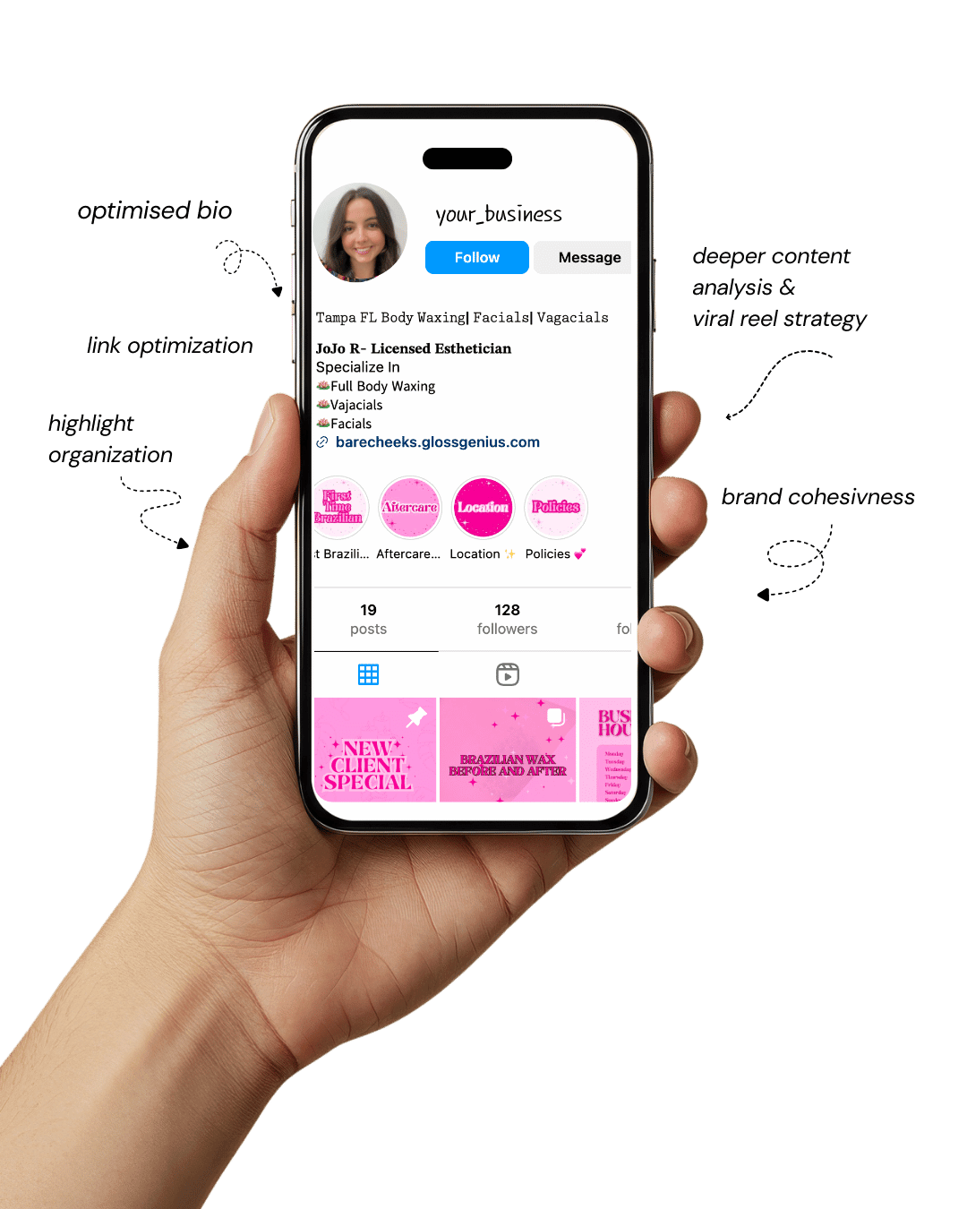
Your Instagram isn’t the problem.
The strategy is.
Get a free, honest audit of your Instagram profile — tailored for beauty, wellness & creative brands.
You’ll receive: profile fixes · content gaps · bio upgrades · content ideas.
I personally review your profile and send a clear, actionable breakdown — no AI, no templates.
20 Minimalist Canva Templates That Make You Look Like a Pro Designer
If you’ve ever felt stuck staring at a blank page in Canva wondering how to make your content pop, minimalist Canva templates might be just the game-changer you need.
These tailor-made layouts simplify the design process while delivering polished, professional results — perfect for everything from social posts to digital downloads.
Using the right Canva templates not only saves you time but helps maintain consistent branding, which is especially important if you’re running a small business or building a personal brand.
In this article, we’ll dive into how and why minimalist templates create impact, then walk through 20 of the best options — and finally share some extra steps you can take to improve your results.
By the end, you’ll feel confident choosing and customizing Canva templates like a pro. #CanvaTemplates #PinterestDesign #SmallBusinessTips #AestheticBranding #DigitalDownloads
Why Minimalist Canva Templates Matter (and What They Bring)
Minimalist Canva templates make a difference because they strip design back to its essentials — clean lines, limited typography, and thoughtful negative space — which keeps attention on your message rather than distracting with embellishments.
For business owners and creators, that means strong brand recognition and faster turnaround for content.
Using well-crafted Canva templates also ensures you don’t reinvent the wheel every time: you establish a system that works.
Professionally designed templates include built-in grid layouts, consistent margins, and style-guide elements (fonts, colors) so you’re not guessing each time.
Technically, a good minimalist template uses alignment, spacing, hierarchy of type sizes, and contrast for readability and brand impact.
That attention to detail — often overlooked — makes your content feel high-end. In short: you look like a pro, save time, stay on-brand, and deliver content that converts.
1. Simple Grid Social Post Template
One of the most versatile options in your Canva templates toolkit is the simple grid social post template.
This layout uses a clean square grid — often three or four panels — to juxtapose image and text in a balanced way.
Technical tip: ensure your grid uses equal gutters (spacing between panels) and aligns to a 12-column structure behind the scenes: many designers use 12 columns because it divides evenly by common widths.
When you import your brand assets (logo, color swatches) into the template, keep typography to two weights (regular + bold) and stay within 30-36pt for heading and 14-18pt for body copy — these specs ensure readability on mobile.
By leveraging this as one of your core Canva templates, you can maintain consistency across posts and quickly repurpose content for multiple platforms.
2. Clean Typography Quote Template
Quotes are everywhere on social media, so having a clean typography quote Canva template is essential. The key here is hierarchy: set the author’s name in a smaller size (e.g., 14-16pt), the quote itself in a larger size (24-30pt), and add subtle visual cues like a thin line or oversized first letter (a drop‐cap) for flair.
From a technical perspective, make sure the baseline grid is active so that text lines align horizontally across different layouts — this keeps your quote visuals cohesive.
Also, lock the background element so when you export multiple variants you won’t accidentally shift alignment. With this minimalist template, you’ll keep your feed visually aligned, branded, and on message.
3. Minimalist Instagram Story Highlight Cover
Your Instagram Story highlights might be overlooked, but they’re a permanent fixture on your profile — so using a minimalist Canva template designed for highlight covers is smart.
Choose a single icon in the center (e.g., from Canva’s icon library), set it in your accent brand color, and place it within a circle that is centered both horizontally and vertically.
Technically, ensure the icon is vector (SVG) so it scales cleanly and doesn’t blur when you adjust size.
Also, maintain safe margins inside the Instagram profile display area — to avoid cropping when the app applies circular masks.
Once you lock these specs in your template, every highlight cover you generate will look crisp and professional.
4. Clean Newsletter Header Template
When you send out a newsletter, your header sets the tone — and using a minimalist Canva template here helps unify your brand with your email content.
Use a wide layout (e.g., 800 × 200 pixels or 1600 × 400 to retain quality on high-res screens) and focus on a single headline with plenty of negative space around it.
Technically, convert your text to outlines (if exporting to PDF) to avoid font substitution issues across email clients.
Embed your logo at 72 dpi for web use (but keep original version saved at 300 dpi for print). Using this kind of template ensures emails look clean, modern and consistent with other visuals.
5. Simple Slide Deck Template for Webinars
If you host webinars or online presentations, a slide deck with minimalist design will make you look polished.
In your Canva templates, set a master slide with a simple title area and subtitle, and a footer with your branding.
Technically, use a 16:9 aspect ratio (1920 × 1080 pixels) for full-screen display and ensure elements don’t appear too close to the edges — use a safe margin of 0.5 inches.
Also, embed system fonts or licensed fonts to avoid display issues when you export. This kind of template means your slides stay consistent, focused, and professional, enhancing credibility.
6. Clean Product Feature Graphic Template
For businesses offering products or services, a product feature graphic needs to showcase the item cleanly and attractively.
Choose a minimalist Canva template where the product image is prominent and set on a neutral or brand-color background with a headline and short bullet list.
Technically, mask your product photo into a consistent shape (e.g., circle or rounded rectangle) to maintain layout uniformity across different products.
Also export at 300 dpi if you plan to print this graphic (for brochures or print ads). With this template, you’ll present your offerings clearly and stylishly.
7. Minimal Social Media Cover Photo Template
Cover photos (Facebook, LinkedIn, YouTube) often get neglected but they’re key brand real estate. Use a minimalist Canva template sized for the correct platform (LinkedIn banner: 1584 × 396 px; Facebook: 820 × 312 px) and leave a large empty space so the header doesn’t feel cluttered.
Technical tip: Keep critical elements within a safe “live” zone—usually the central 1230 × 338 area for Facebook — so it doesn’t get cropped on mobile.
This kind of template ensures your cover looks consistent and professional across platforms.
8. Minimal Ebook Cover Template
If you’re creating digital downloads like ebooks or guides, a cover design matters. The minimalist Canva template here should use one strong image or graphic, your title in large clean type, and a subtle tagline.
From a technical standpoint, set your file size at 3000 pixels tall to ensure readability on retina displays and export as PDF-X if distributing.
Also embed fonts or rasterize text to prevent missing fonts issues. That strong template gives your digital product presence and credibility.
9. Clean Pinterest Pin Template
Since Pinterest is built for visuals, using a dedicated minimalist Canva template for pins is strategic. The optimal size is 1000 × 1500 pixels or 2:3 ratio.
Make sure your headline is visible even when the pin is small in the feed — keep font size ~60pt and avoid placing text at edges where it may get cut off.
From a technical view, export as PNG for crisp detail and include your website URL in the footer so traffic attribution is easier.
This template ensures your pins are clickable, brand-consistent, and high-impact.
10. Minimal Flyer or Poster Template
Even in a digital-first world, printed marketing materials are still useful. A minimalist flyer Canva template might be A4 size (210 × 297 mm) or US Letter (8.5 × 11 in) and use one dominant visual with minimal text.
Technically, set bleed at 3 mm and include CMYK color mode if sending to print. Keep the safe margin at least 10 mm from edges so nothing gets cut.
With this template, you’ll produce flyers that aren’t just generic — they look well-designed and intentional.
11. Simple Business Card Template
Your business card is a physical extension of your brand, so the Canva templates you use here should reflect the minimalist aesthetic.
Design at 3.5 × 2 in (or 85 × 55 mm) plus 0.125 in (3 mm) bleed. Use one side for your logo, one for contact details.
Technically, convert your file to 300 dpi and CMYK colors for print precision. Align text along the baseline grid, use consistent spacing, and avoid tiny font sizes under 8pt which risk illegibility.
This template elevates your branding in real-world encounters.
12. Minimal Newsletter Template for Printable Handouts
If you create printable handouts or newsletters, a minimalist Canva template designed for print adds a professional touch.
Use US Letter size, margins of 0.5 in, and two-column layout for readability. Technical tip: Set bleeds and marks if sending to a commercial printer, ensure you embed all fonts or flatten text.
Use 300 dpi images and link them within your Canva template for faster updates. With this template, your handouts will look clean and aligned with your digital branding.
13. Clean Welcome Email Graphic Template
When a subscriber joins your list, the first email should make a strong brand impression. Use a minimalist Canva template sized at 600–700 px wide (common max width for email).
Your graphic should include a short welcome headline, perhaps a subtle brand accent. Technical detail: optimize file size (under 200 KB) so it loads quickly and use alt-text for accessibility.
This template means you deliver a high-quality first impression.
14. Minimal Lead Magnet Cover Template
Lead magnets (checklists, cheat-sheets) drive opt-ins, so presenting them using a minimalist Canva template matters.
Create a cover size around 1600 × 2400 px for digital use, use a bold title and simple subheading, and reserve a corner for your logo.
Technical tip: include clickable links if your download supports them and export as interactive PDF when needed. Having this template ensures your opt-in offers look curated and valuable.
15. Simple Instagram Carousel Template
Carousels can boost reach, but only if they’re visually consistent. A minimalist Canva template for Instagram carousel (1080 × 1080 px per slide) should share a uniform header/Footer across slides and uniform typography scale.
Technical note: when exporting, make sure filenames maintain order (e.g., slide1.png, slide2.png) so Instagram recognises sequence.
Also keep total file size manageable. This template lets you deliver multi-page stories that feel cohesive and on-brand.
16. Minimal Event Invitation Template
Hosting a workshop or webinar? Use a minimalist invitation template in Canva sized appropriately (1080 × 1350 px for social or A5 for print).
Keep a strong focal image, minimal text, and call-to-action. Technical detail: use vector shapes for icons and export both RGB (for web) and CMYK (for print) versions. This template elevates your event presence.
17. Clean Pricing Sheet Template
When you present services or packages, a pricing sheet needs clarity. A minimalist Canva template here might be US Letter portrait, with three service tiers side by side.
Technical tip: use consistent alignment across columns, apply consistent currency formatting and spacing, and lock header/footer for updates. This template gives your pricing presentation a professional polish.
18. Minimal YouTube Thumbnail Template
Thumbnails drive click-throughs on YouTube, so your Canva templates should be optimized accordingly.
Size at 1280 × 720 px, keep text large (minimum 45pt), avoid overcrowding, and ensure visuals are legible on mobile.
Keep file size under 2 MB and export as JPG with 80% quality for balance. This template helps you maintain a cohesive channel identity and improve engagement.
19. Simple Thank You Card Template
Whether digital or printed, a simple “thank you” card enhances customer experience. Use a minimalist Canva template sized at 5 × 7 inches, with centered text and maybe one accent graphic.
If printed, add 300 dpi resolution, set bleed, and use Pantone or CMYK for color accuracy. This template makes every thank-you feel intentional and on-brand.
20. Clean Podcast Cover Template
Launching or promoting a podcast means you’ll need a strong cover graphic. Use a minimalist Canva template sized at 3000 × 3000 px (required minimum size by many platforms), keep the design bold yet uncluttered, with the podcast name and host visual/icon.
Keep main visuals within the central safe zone (about 2400 × 2400 px) so they appear well on mobile thumbnail displays. This template ensures your podcast art looks professional across directories.
Additional Steps to Improve Results
Having chosen strong minimalist Canva templates, there are additional steps you can take to elevate your results further.
First, create a brand asset folder in Canva where you store your logo, brand fonts, color codes, and any recurring graphic elements; linking these into each template ensures consistency.
Second, use Canva’s “master page” feature for multi-page templates so changes to header or footer propagate automatically.
Third, test export settings: for web use export at 72 dpi RGB, for print use 300 dpi CMYK and include bleeds.
Fourth, keep a style guide that details element spacing (e.g., always 16px margin), and typography rules (e.g., heading always 30pt, subheading 18pt, body 14pt) so every piece created with your Canva templates aligns.
Finally, review your analytics (click rates, engagement) to see which templates perform best, and iterate by tweaking font size, image placement or color usage accordingly.
Final words
Minimalist Canva templates give you the power to present your brand like a seasoned designer, without the steep learning curve.
By following the list of thoughtfully curated templates above — and incorporating those extra optimization steps — you’ll create content that’s consistent, polished, and effective.
Whether you’re posting on social media, designing lead magnets, or setting up event graphics, these templates will have you covered.
For a small business owner, creator, or anyone building an aesthetic brand, these tools are a game-changer.
So open Canva, pick your template, customize with your brand assets, and start creating visuals that draw attention and drive engagement. #CanvaTemplates #AestheticBranding